
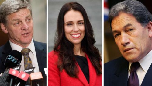
Which of Labour or National Shares the Most With New Zealand First Demographically?

Is has been argued that Winston Peters ought to go with whichever side is most like New Zealand First demographically – but which is it?

There are many competing reasons for thinking that Winston Peters ought to go with one or the other of Labour or National in the post-election negotiations to form a Government. Some say that any arrangement with the Greens involved will not be stable enough, some say that the Opposition parties won a clear majority and therefore a mandate for change, some say that Winston will go with whoever he feels like going with. This article, by Understanding New Zealand author Dan McGlashan, looks at things another way.

We will follow here the argument that Peters ought to side with whichever out of Labour and National represents the people most similar to their own, and to that end this article will make a judgment using six major demographic categories, viz. age, ethnicity, education, income level, gender and homeownership rates.

Age

The correlation between voting National in 2017 and median age was a very strong 0.77, which represents the old people who own everything, and between voting Labour in 2017 and median age it was -0.66, which represents the people who are yet to become financially established and are living primarily on their wages.

The correlation between voting New Zealand First in 2014 and median age was negative, at -0.08, but by 2017 it had become significantly positive, at 0.24. This is primarily because of a large number of young, working-class Maoris shifting to Labour.

Young people drifted away from New Zealand First this election, and old people drifted in. The correlation between being aged 20-29 and voting New Zealand First was -0.38 in 2014 but had become -0.60 by 2017, whereas the correlation between being aged 65+ and voting New Zealand First was 0.10 in 2014 and had become 0.36 by 2017.

Young voters tend to not like either National or New Zealand First, whereas elderly voters like both, so that suggests a greater age overlap with the National Party. Decisively, the correlation of 0.24 between voting New Zealand First in 2017 and median age is 90 basis points away from the Labour figure, and only 53 basis points away from the National figure, so National win this one.

National 1, Labour 0

Ethnicity

The stereotype is of New Zealand First as an old, white, racist’s party, which is a very odd perception when it’s led by someone who played for the Auckland Maori rugby team. The truth is much more complex.

Voting New Zealand First in 2014 and being a Kiwi of European descent was perfectly uncorrelated, at 0.00. Between voting New Zealand First in 2014 and being Maori the correlation was a strongly positive 0.66. That means that at the time of the last election, the stereotype of New Zealand First voters was entirely false.

Some truth crept into it in 2017, however. By 2017 the correlation between being a Kiwi of European descent and voting New Zealand First had risen to 0.19, whereas the correlation between being Maori and voting New Zealand First had fallen to 0.40. This means that New Zealand First is still more of a Maori party than it is anything else, but that sentiments of white Kiwis are also well represented.

The correlation between being a Kiwi of European descent and voting National in 2017 was a strong 0.51, and for voting Labour it was correspondingly weak, at -0.56.

This means that New Zealand First is slightly more like National when it comes to whiteness, but far more like Labour when it comes to Maoriness. The correlation between being Maori and voting National in 2017 was a strongly negative -0.68, whereas the figure for voting Labour in 2017 was, at 0.57, very close to the New Zealand First figure.

New Zealand First was fairly to similar to National in that their party was mildly disfavoured by Pacific Islanders, in contrast to Labour. The correlations between being a Pacific Islander and voting National or New Zealand First in 2017 were -0.35 and -0.17 respectively, very different to the correlation between being a Pacific Islander and voting Labour, which was, at 0.57, as strong as the one with being Maori and voting Labour in 2017.

This is unlike the case of Asians, who were moderately more likely to prefer National to Labour, and who despise New Zealand First. The correlation between being Asian and voting National in 2017 was 0.10, only a smidgen stronger than what it was in 2014. Between being Asian and voting Labour in 2017 it was -0.09, but between being Asian and voting New Zealand First in 2017 it was -0.58.

All in all, if you weight each ethnicity by the number of Kiwis belonging to it, it’s more or less a draw.

National 1.5, Labour 0.5

Education

Labour shares with New Zealand First an affinity from those with few NZQA qualifications. New Zealand First was by far the most poorly educated voting bloc in 2014, and, although it’s true that they still are, the margins became smaller.

The correlations between having no NZQA qualifications and voting New Zealand First or Labour in 2017 were similar, at 0.69 and 0.45 respectively, and very different to that of having no NZQA qualifications and voting National in 2017, which was -0.32.

This isn’t really surprising because someone with no NZQA qualifications is not likely to have a large income or a number of rental houses, and so will not benefit from National’s refusal to institute a capital gains tax, and they are very likely to be living hand to mouth or close to it, which means they lost out from the rise in GST to 15%.

Some will be very surprised by the voting patterns of the highly educated, though. On the one hand, it might not be surprising that the university educated were mildly disinclined to vote Labour in 2017. The correlations with doing so were -0.32 for people with a Bachelor’s degree, -0.28 for people with an Honours degree, -0.27 for people with a Master’s degree, and -0.21 for people with a doctorate.

But neither were they particularly inclined to vote National. The correlations with voting National in 2017 were 0.15 for having a Bachelor’s degree, 0.10 for having an Honours degree, and 0.09 for having either of the two highest degrees. As it turns out, a large number of these people voted TOP, ACT or Green.

Compared to their sentiments towards Labour and National, university graduates are extremely disinclined to support New Zealand First. The correlations between voting New Zealand First in 2017 and having a university education was -0.73 in the case of having a Bachelor’s degree, -0.69 for an Honours degree, -0.74 for a Master’s degree and -0.60 for a doctorate.

This suggests that neither Labour or National have much in common with New Zealand First educationally, but Labour does share with New Zealand First a supporter base of very uneducated people. This is worth three-quarters of a point to Labour and one quarter to National.

National 1.75, Labour 1.25

Income

Leaving aside the truly broke, who know that their bread is buttered with Labour, not National, and who are indifferent to New Zealand First, voters in every income band are about equally likely to prefer Labour and New Zealand First to National.

The most wealthy Kiwis dislike New Zealand First even more than they dislike the Labour Party, which is perhaps a commentary on how the Labour Party supports the wealthy by way of supporting neoliberalism.

People with an income of $150K+ had a correlation of 0.24 with voting National in 2017, -0.43 with voting Labour in 2017 and -0.51 with voting New Zealand First in 2017, and those with an income of $100-150K had a correlation of 0.26 with voting National in 2017, -0.40 with voting Labour in 2017 and -0.54 with voting New Zealand First in 2017.

This suggests that the people who are creaming it the most look at Labour and New Zealand First with a similar level of disdain.

People in the $50-60K income band were almost perfectly indifferent to all three parties. The correlation between being in this income band and voting National in 2017 was 0.01, with voting Labour in 2017 it was -0.03 and with voting New Zealand First in 2017 it was 0.04.

This tells us that people in the middle – either the young, poor, ambitious and going up or the old, middle-class, satisfied and looking to hang on – wouldn’t really mind which way Peters went.

The people in the working-class income bands between $25 and $40K, in contrast to those in the $100K+ income bands, look at Labour and New Zealand First with a similar level of approval.

Kiwis earning $35-40K had a correlation of 0.49 with voting New Zealand First in 2017, which is much closer to the correlation between being in this income band and voting Labour in 2017 (0.38) than it is to the one between being in this income band and voting National in 2017 (-0.37).

In the income bands lower than this, people tended to support New Zealand First all the more. To the poorest New Zealanders, there is no apparent difference between National and Labour, and such a mindset seems to find a home in New Zealand First.

Ultimately, wealthy Kiwis like National and dislike Labour and New Zealand First, and poor Kiwis dislike National and like Labour and New Zealand First, so this one goes to Labour.

National 1.75, Labour 2.25

Gender

The correlation between voting National in 2017 and being male was 0.23, understandable as men earn more money than women and are therefore relatively likely to lose from the balance of taxation and welfare spending.

The correlation between voting Labour in 2017 and being female was 0.40, also understandable for the opposite reasons to why the men vote National – women earn less money and therefore benefit more from a party that raises taxes for the sake of social spending.

New Zealand First voters fell right in the middle. The correlation between voting New Zealand First in 2017 and being female was 0.10, which placed it almost exactly as far away from the National figure as from the Labour one.

In other words, New Zealand First voters were slightly more likely to be female, which fell in between National’s moderately more likely to be male and Labour’s strongly more likely to be female.

National 2.25, Labour 2.75

Homeownership

Curiously, the correlations between living in a mortgaged house and voting in 2017 for any of the three parties under discussion were basically identical. For National and Labour it was both 0.16, and for New Zealand First it was 0.14.

For living in a freehold house, things were a bit different. Predictably, people who lived in freehold houses were much more likely to vote National than Labour. The correlation between living in a freehold house and voting for National in 2017 was 0.65, and with voting for Labour in 2017 it was -0.51.

But people who voted New Zealand First fell almost right in the middle – the correlation between living in a freehold house and voting New Zealand First in 2017 was 0.22. This might be marginally closer to National but this was not the case in 2014. At that election, voting for New Zealand First had a correlation of -0.05 with living in a freehold house.

A similar pattern presented itself for those who were renters. The correlation between living in a rented house and voting for National in 2017 was a very strong -0.79, and with voting for Labour in 2017 it was also fairly strong, but in the other direction, at 0.56.

Again, New Zealand First voters fell in the middle. The correlation between living in a rented house and voting Nw Zealand First in 2017 was -0.26, which again falls right in between Labour and National. This one has to be another tie, at half a point each.

Final score: National 2.75, Labour 3.25

In the final analysis, it would be far from easy for Peters to choose between Labour and National on the basis of demographic similarities. Age would push him towards National, income towards Labour, and gender and homeownership rates would be even.

This makes for a very strong negotiating position in one sense. Unlike the Green Party – who cannot support National without committing suicide in the manner of the Maori Party and the British Liberal Democrats – New Zealand First could plausibly support either Labour or National, meaning that either side has an incentive to offer as much as it can to them.

However, Winston Peters has also been forked. He has to make one group of committed New Zealand First supporters unhappy. Either he makes the elderly European contingent unhappy by going with the Green Party, or he makes the working-class Maori contingent unhappy by going with National.

No doubt this calculus means that Peters will take his sweet time, and consider every possibility, before deciding on whose head he will place the crown.

*

This article is an excerpt from the 2nd Edition of Understanding New Zealand, which Dan McGlashan and VJM Publishing will have ready for sale at the end of October 2017. This will contain statistics calculated according to the official final vote counts and will be freshly updated with data from the 2017 General Election.

Where Labour Won Their Extra Ten Percent

The Labour Party won about 10% more of the electorate in 2017 than they did in 2014 – but where did these new voters come from?

The Labour Party under Jacinda Ardern won an extra ten percent of voters compared to the previous election. In 2014, under David Cunliffe, they won a paltry 25.1% of the total vote, but in yesterday’s election they won 35.8% (specials are yet to be counted but shouldn’t affect Labour’s vote percentage much). This article, by Understanding New Zealand author Dan McGlashan, looks at where they won these new voters from.

In the broadest and crudest sense, the Labour Party won a lot of support back from middle-class, middle-aged to elderly white people who had previously voted National, and from Maoris who had previously voted New Zealand First.

The correlation between voting Labour in 2014 and being a Kiwi of European descent was -0.76, but by 2017 this correlation had weakened to -0.56. This shift from negative to positive was replicated by the correlation between being Maori and voting Labour, which was 0.42 in 2014 and which had strengthened to 0.57 by 2017.

Taken together, these statistics suggest that Labour strengthened their position among the New Zealand-born. Indeed, we can see that the correlation between being born in New Zealand and voting Labour in 2014 was not significant at 0.01, but it had grown sharply to a mildly significant 0.30 by 2017.

This was met by corresponding drops in support from demographics who have a high proportion of immigrants. The correlation between being born in the Pacific Islands and voting Labour was 0.68 in 2014, and this fell to 0.43 in 2017, and also the correlation between born in North East Asia became more strongly negative, from -0.17 in 2014 to -0.35 in 2017.

These can be explained by the fact that some Pacific Islanders have been here long enough now to become part of the middle class. Conservative religious sentiments might have pushed some to National as well. Likewise, many of the Asian immigrants who have arrived recently are the moneyed classes looking to shift capital from Asia, and are different to the younger, educated Asian immigrant that Labour tended to let in.

There was already a notable gender gap when it came to supporting one of the two major parties. The correlation between being female and voting Labour in 2014 was already 0.31, but by 2017 this had strengthened to 0.40. There was also a very large reduction in the strength of the correlation between working part time and voting Labour. This was -0.65 in 2014 and -0.40 in 2017.

The Labour vote was also a fair bit older in 2017.

The correlation between being in the 20-29 age bracket and voting Labour in 2014 was 0.32, and this had fallen to 0.13 by 2017. Many of these people would have been young students who were persuaded to vote for The Opportunities Party.

The correlations for older age groups, on the other hand, became less strongly negative. The 50-64 age bracket had a correlation of -0.68 with voting Labour in 2014, but this had fallen to -0.59 by 2017. Likewise, the 65+ age bracket had a correlation of -0.58 with voting Labour in 2014, and this fell to -0.51 by 2017.

An interesting point here is that the correlation with being born in Britain in 2014 (-0.73) remained equally as strongly negative in 2017. So this tells us that a much greater proportion of this middle-aged to elderly group that switched from National to Labour were people with family in New Zealand, probably therefore grandchildren.

It might be that these people, having observed the sharper effects of neoliberalism on their wider family, no longer felt motivated to support it in the same way they did in 2014. After all, it was mostly this same group of people who made the most cash out of National’s immigration policies.

Further clues come from the patterns of voters based on their industry. Some industries shifted sharply towards Labour in 2017. Most notable were healthcare and social assistance (which had a correlation of -0.00 with voting Labour in 2014 compared to 0.20 in 2017) and education and training (which had a correlation of -0.01 with voting Labour in 2014 compared to 0.17 in 2017). Also notable is that the occupation of community and personal services workers had a correlation of 0.20 with voting Labour in 2014, increasing to one of 0.36 in 2017.

What this might suggest is that Kiwis whose jobs put them into contact with other people were the most likely to switch from National to Labour.

It could be that the type of Kiwi who is an everyday grandparent, and who has taken on a social conscience in their semi-retirement, has switched some of their sentiments away from National because of a lack of confidence in the belief that they would leave a good New Zealand to their grandchildren.

Looking at the statistics of the income bands, we can see that Labour’s surge won it back much of the middle ground. Although Kiwis with an annual income of less than $15K continued to overwhelmingly favour Labour, there was a swing towards them in the income bands of those groups in the centre.

The correlation between having a personal income of $15-20K and voting Labour rose to 0.13 in 2017 from -0.05 in 2014, and the correlation between having a personal income of $20-25K and voting Labour rose to 0.10 in 2017 from -0.09 in 2014. Even though these income bands are the common student ones, it was not there that the gains were made – the correlation between being on the student allowance and voting Labour in 2017 was, at 0.32, weaker than it had been in 2014 (0.34).

Taking into account the big Labour gains among part-time workers, what all this suggests is that a middle-class, elderly group of voters, probably with wider community ties and a stronger historical sense of what the country used to be like, have come to feel that Kiwi values are no longer represented by the direction the country is taking.

It’s important not to overplay this – the bulk of wealthy, older, white voters still went with National – but there is a clear trend evident. The electorate is simply not as convinced that the country is going in the right direction anymore, and the centre is starting to shift towards Labour.

*

This article is an excerpt from the 2nd Edition of Understanding New Zealand, which Dan McGlashan and VJM Publishing will have ready for sale at the end of October 2017. This will contain statistics calculated according to the official final vote counts and will be freshly updated with data from the 2017 General Election.

Who Voted for The Opportunities Party?

The Opportunities Party found the best reception among the young professional class that had previously supported the Greens

Gareth Morgan’s project The Opportunities Party (TOP) ultimately fell short of the Parliamentary threshold, but there is already enough data for us to know who voted for them in last night’s election. Dan McGlashan, author of Understanding New Zealand, has a look at the demographics of TOP voters in this article.

The most striking statistics are that TOP took a small number of votes off both the Aotearoa Legalise Cannabis Party and the Maori Party, and a huge number of votes off the Greens.

The correlation between voting TOP in 2017 and voting Greens in 2014 was an extremely strong 0.81, which tells us that the vast bulk of TOP voters came from there. Most correlations between voting TOP in 2017 and voting for other parties in 2014 were not significant: 0.16 for the ALCP, 0.15 for the Maori Party, -0.13 for Labour, -0.14 for National and -0.17 for New Zealand First.

Only two significantly negative correlations existed here. These were -0.28 between voting TOP in 2017 and voting ACT in 2014, and -0.36 between voting TOP in 2017 and voting Conservative in 2014. The reason for this is probably because these are the two parties who most conspicuously lack the social conscience that TOP campaigned on.

Crudely speaking, that suggests that TOP voters came from two main groups of roughly equal size. The first were disaffected Green voters, and the second were disaffected voters from all over the rest of the political spectrum.

In what is perhaps a function of the degree of social media saturation they achieved, TOP did the best among the technophilic segment of society. The correlation between voting TOP in 2017 and working as a professional was 0.64. The correlation between working as a professional and voting Greens in 2014 was 0.73, and this had collapsed to -0.10 by 2017, so it seems that the professional class almost wholesale shifted their loyalties from the Greens to TOP.

This is further underlined by the fact that there were moderately strong positive correlations between voting TOP in 2017 and having any university degree: 0.40 for having a Bachelor’s, 0.63 for having an Honours, 0.45 for having a Master’s and 0.58 for having a doctorate. These were all much more positive for TOP than for the Greens.

It was mostly white people who supported TOP. The correlation between voting TOP in 2017 and being of European descent was 0.37, compared to 0.05 for being Maori, -0.25 for being Asian and -0.40 for being a Pacific Islander. Although Asians usually have better educations than Kiwis of European descent, professional Asians tend towards ACT and, increasingly, National.

Perhaps the most striking correlation was the 0.60 between having no religion and voting TOP in 2014. This may the natural result of appealing to people on the basis of evidence, which is another way of saying that they want people who can think for themselves, and people like this are the group that rejects religious dogma the most strenuously.

It follows from these numbers that the average TOP voter would be fairly young, and indeed they are. The correlation between median age and voting TOP in 2017 was -0.14, compared to 0.11 with voting Greens in 2017. Considering that the correlation between median age and voting Greens in 2014 was -0.17, this suggests that TOP took much of the student/university vote from the Greens.

Indeed, we can see that the correlation between voting TOP in 2017 and being on the student allowance was a moderately strong 0.45. Considering that the correlations between being on the student allowance and voting Green collapsed from 0.55 in 2014 to -0.10 in 2017, we can guess that this shift was largely due to the influence of TOP.

Related to this is the fact that the strongest correlation between voting TOP and being in any age bracket is 0.36 with being aged between 20 and 29. The next strongest were the two neighbouring brackets of 15-19 and 30-49, all of which reflects that young people tend to have more active online social lives, where TOP did most of its advertising.

There were also very strong positive correlations between voting TOP in 2017 and working in arts and recreation (0.70), public administration and safety (0.66), education and training (0.52) and professional, scientific and technical services (0.50). These are the same industries that are most likely to employ the forward-thinking, educated young professional that used to call the Greens home.

The negative correlations with voting TOP in 2017 and working in a specific industry came with those whose workers do not tend to spend a lot of time online: manufacturing (-0.38), wholesale trade (-0.35), transport, postal and warehousing (-0.19) and agriculture, forestry and fishing (-0.11).

TOP voters were also significantly more likely to be born in New Zealand. The correlation between voting TOP in 2017 and being born in New Zealand was 0.26. Following naturally from the absence of sharp gender-based roles among the young professional class, the correlation between voting TOP and being male was only -0.02.

Going against the easy trend of a young elite is the correlation between voting TOP in 2014 and being a regular smoker, which was -0.05. One would expect it to be much more strongly negative considering the educational achievements of the average TOP voter (educated people smoke significantly less), but this weak correlation can be explained by the sizable number of cannabis law reform supporters who voted TOP, something also suggested by the collapse of the ALCP vote in the presence of another party who offered full legalisation.

Voting for TOP in 2017 had the same correlation with family income as voting National in 2017 did – 0.39 – which tells us that the average TOP voter is doing quite well. A picture starts to emerge of the average TOP voter as a person of either gender in their mid 20s to late 30s, university educated, probably with foreign experience and ambition, who is very rejecting of dogma and hierarchical thought and wants to make a clean break with the past, but who is also well-to-do in measures of social and mental health.

Some might say that this was the best sort of person that New Zealand has to offer, which is something for Gareth Morgan to consider if he wants to run again in 2020.

*

This article is an excerpt from the 2nd Edition of Understanding New Zealand, which Dan McGlashan and VJM Publishing will have ready for sale at the end of October 2017. This will contain statistics calculated according to the official final vote counts and will be freshly updated with data from the 2017 General Election.

Where Did the National Party Lose Their Majority?

Elections are won and lost by slim margins nowadays and subtle shifts have weakened National’s position compared to 2014

The drama may not be over, but we can eliminate one outcome even before negotiations begin: it is now clear that the National Party failed to get enough seats to govern alone or with support partners as suppliant as ACT, United Future and the Maori Party (the last two of whom were eliminated last night). If they are to govern, it must be with New Zealand First, which is a significant weakening of their position compared to the previous election. This article looks at where National lost support from 2014.

First of all, it’s apparent that the people who voted National last night were basically the same sort of person who always votes National. The correlation between voting National in 2017 and voting National in 2014 was 0.989. So the differences between the people who voted for them last night and who voted for them in 2014 are subtle.

The National Party did worse with white people this time around, although white people were still the overwhelming bulk of National voters. The correlation between being of European descent and voting National in 2017 was 0.51, down from 0.60 in 2014, balanced by an increase in the correlation between being Asian and voting National in 2017 (up to 0.17 from 0.09 in 2014) and between being a Pacific Islander and voting National in 2017 (up to -0.38 from -0.46 in 2014).

This is suggestive of a fairly large segment of both Asian and Pacific Islander people who have managed to rise above their previous economic situation. It also reflects the increase in correlation between working in wholesale trade and voting National in 2014 (0.19) compared to voting National in 2017 (0.26), because wholesale trade is itself an industry with a large proportion of Asian workers.

Because Asians and Pacific Islanders are more likely to be born overseas than Maoris and white people, this has led to a strengthening of the correlation between being born overseas and voting National, which was already moderately significant at 0.33 in 2014 but has since then increased to 0.39 in 2017.

South Islanders still support the National Party more than North Islanders, but the correlation between living on the South Island and voting National went down from 0.13 in 2014 to 0.07 in 2017. This is probably a reflection of the fact that National increased their support among recent immigrants at the expense of Kiwi-born voters, because a relatively higher proportion of recent immigrants live on the North Island.

The correlation between working in a particular industry and voting National in 2017 increased from 2014 in the case of manufacturing (up to -0.19 from -0.23), wholesale trade (up to 0.26 from 0.19) and transport, postal and warehousing (up to -0.47 from -0.51), and decreased from 2014 in the case of mining (down to -0.05 from 0.00), hospitality (down to -0.23 from -0.18), professional, scientific and technical services (down to 0.15 from 0.18), public administration and safety (down to -0.30 from -0.26), education and training (down to -0.31 from -0.27), healthcare and social assistance (down to -0.23 from -0.18) and recreation and arts services (down to -0.22 from -0.17).

This is perhaps interesting because it suggests that people are more likely to go from voting National to voting Labour if they have a social job, compared to being even more likely to vote National if they have a relatively unsocial job.

Related to this is that social occupations tended to leak support for National compared to unsocial ones. Although managers continued to strongly support National in 2017, as the correlation between working as a manager and voting National in 2017 was 0.52, this was weaker than with voting National in 2014, which was 0.56. A similar drop was seen in community and personal services workers, whose correlation with voting National in 2017 dropped to -0.58 from -0.53 in 2014.

Taken together, these correlations show that people whose jobs bring them into contact with the most people are the most likely to feel that the country needs a change in direction, perhaps suggesting that they have observed an increase in human misery to intolerable levels.

Some won’t be surprised to note that the correlation between living in a mortgaged house and voting National in 2017 increased to 0.05 from 0.01 in 2014 – perhaps an indication that people in this group are afraid of the market crashing and leaving them with negative equity. Tellingly, this group became much less willing to vote New Zealand First – the correlation between living in a mortgaged house and voting New Zealand First in 2017 dropped to 0.06 from 0.12 in 2014.

Taken together, those numbers suggest that a lot of people want the game of hot potato being played with house prices and immigrants to continue for a while yet.

Where the election seemed to be lost for National, at least in terms of their hopes of governing alone or with ACT only, is when the real elite class, despite still mostly supporting National, did so less overwhelmingly than in 2014.

The correlations between being in any of the four highest income brackets and voting National all weakened from 2014 to 2017. These were those earning $60-70K (down to 0.21 from 0.24), those earning $70-100K (down to 0.32 from 0.36), those earning $100-150K (down to 0.31 from 0.34) and those earning $150K+ (down to 0.31 from 0.35).

They also weakened noticeably among holders of postgraduate degrees. Voters with an Honours degree had a correlation of 0.22 with voting National in 2014 but only one of 0.17 with voting National in 2017. Holders of Master’s degrees (down from 0.20 in 2014 to 0.17 in 2017) and doctorates (down from 0.20 to 2014 to 0.14 in 2017) followed the same pattern.

The cohort of National voters is also younger this year compared to 2014. The correlation between median age and voting National decreased to 0.77 in 2017 from 0.81 in 2014.

What all this tells us is that there were three major trends in play last night.

The first one is that Labour won votes off the Greens, New Zealand First and National. Labour won a huge number of Maori voters from New Zealand First and the Greens – the correlation between being Maori and voting Labour in 2014 was only 0.42, but in 2017 it was 0.58.

The second is that National won a lot of votes from people who were educated and young and Green-voting in 2014, but who grew up to be wealthy, middle-class and incentivised to vote with their wealth interests in 2017. The Greens dominated this segment of the population in 2014 and lost most of them by 2017, chiefly to TOP and to National.

The third is that National lost a lot of votes from the sort of person who is the real power elite of the country. Although the rich, the employers, the owners of freehold land, Anglicans and educated people all still preferred National to Labour, they were markedly less keen in 2017 than 2014. Many of these people switched to TOP, which is ironic because they now won’t be represented at all (at least not directly).

*

This article is an excerpt from the 2nd Edition of Understanding New Zealand, which Dan McGlashan and VJM Publishing will have ready for sale at the end of October 2017. This will contain statistics calculated according to the official final vote counts and will be freshly updated with data from the 2017 General Election.