The Maori Party made a number of strategic errors over the past decade, and by 2017 the total damage from them had become fatal
When the Maori Party made the decision to support a conservative Fifth National Government, many commentators believed that it would be the death of the party. Indeed, the Maori Party was destroyed at the 2017 General Election, when voters appeared to decide that supporting a conservative government had lowered Maori standards of living. This article looks at who stuck by them and who didn’t from 2014.
Let’s get the most obvious out of the way – there was an extremely strong correlation between voting Maori Party and being Maori. In 2014 this was 0.91, and by 2017 it was slightly weaker, at 0.89. This puts a figure on what we already knew – that the vast bulk of Maori Party voters are Maoris.
In this, and in most other regards, Maori Party voters were very similar to who they were in 2014.
One notable difference is that the Maori Party this year got a fair bit more support from Pacific Islanders. The correlation between being a Pacific Islander and voting Maori Party in 2017 had increased to 0.08 from 0.01 in 2014.
Of course, Pacific Islanders will very seldom be on the Maori Roll and therefore this increased support from them would not have helped the Maori Party win an electorate seat. Indeed, it could even be argued that broadening the Maori Party tent to include Pacific Islanders was one of the main causes of it losing so much support to the Labour Party in 2017.
Considering that the Maori Party won almost as many votes in 2017 (30,580) as it did in 2014 (31,849), it might be that the attempt to broaden their appeal to other ethnic groups, while partially successful, cost them just enough Maori support to mean that they did not win any Maori seats.
This suggestion is backed up by the observation that Maori Party voters were slightly less likely to be New Zealand born in 2017 when compared to 2014. The correlation between the two was 0.62 in 2014 and 0.58 in 2017. Furthermore, the correlation between voting for them and being born in the Pacific Islands became less negative, from -0.19 in 2014 to -0.12 in 2017.
If this is true then it speaks to the string of strategic errors that the Maori Party made. If they gambled their electoral future on public belief in some kind of pan-Polynesian sentiment, they lost everything.
This loss of support to Labour can be seen in microcosm in the education and training industry. The correlation between working in this industry and voting Maori Party fell from 0.38 to 0.34, while it rose in the case of Labour, from -0.01 to 0.15. This means that a person in this industry in 2017 was only slightly more likely to vote Maori Party they were to vote Labour, compared to much more likely in 2014.
It can also be seen with the occupation of community and personal services workers. The correlation between having this occupation and voting Maori Party was 0.64 in 2014, but 0.59 in 2017, whereas the correlations with voting Labour went in the opposite direction – from 0.20 in 2014 to 0.39 in 2017.
So it would seem that a reasonable number of Maori voters in people-focused jobs switched to the Labour Party, and that this was partially compensated for by an increase in Pacific Islander voters.
*
This article is an excerpt from the 2nd Edition of Understanding New Zealand, which Dan McGlashan and VJM Publishing will have ready for sale at the end of October 2017. This will contain statistics calculated according to the official final vote counts and will be freshly updated with data from the 2017 General Election.
The Aotearoa Legalise Cannabis Party may have have won 3,000 fewer votes in the 2017 Election than the 2014 one, but they won more votes than the Conservative Party, four times as many votes as United Future and over half as many votes as the ACT Party. That’s quite a few considering the minimal campaign expenditure. So who voted for the ALCP in 2017, and how were they different to 2014?
The average ALCP voter was fairly hard done by in 2017, slightly worse than in 2014. The correlation between voting ALCP and median personal income was -0.48 in 2017, strengthening from -0.40 in 2014. Also, the correlations between voting ALCP and being in any income band below $50K were all more strongly positive in 2017 than 2014, and were all more strongly negative in 2017 than 2014 for all income bands above $70K.
Part of the reason for this is that many of the voters the ALCP lost from 2014 were the educated, middle-class white ones who ended up voting for TOP. Indeed, it can be seen that this year’s crop of ALCP voters were more poorly educated than last time. All of the correlations with having a university degree and voting ALCP were less strongly negative in 2014 than by 2017 (-0.46 had become -0.51 for a Bachelor’s degree, -0.42 had become -0.49 for an Honours degree, -0.46 had become -0.51 for a Master’s degree, and -0.38 had become -0.45 for a doctorate).
It would seem that the group of ALCP voters that left for TOP between 2014 and 2017 were mostly the same university educated young professionals or students that left the Greens for TOP between 2014 and 2017. This might be little more than 0.1% of voters in the case of shifting from the ALCP, but for a party that small losing them has a big effect.
This means that the ALCP had become a bit less white by 2017. The correlation between being a Kiwi of European descent and voting ALCP fell from -0.15 in 2014 to -0.23 in 2017, while the correlation between being a Pacific Islander and voting ALCP flattened out, from -0.10 in 2014 to -0.00 in 2017. It was even more strongly Maori in 2017 than in 2014: the correlation between being Maori and voting ALCP in the former was 0.91, compared to 0.89 in the latter.
Although there was still a significant correlation between voting ALCP in 2017 and having no religion (0.24), it was a fair bit weaker than the same correlation in 2014 (0.34). This is a fairly distinctive change and gives an idea of the sort of person who switched to the TOP party from 2014.
The ALCP also lost voters in the 30-49 age group. Here the correlation between being of this age group and voting ALCP became more strongly negative: from -0.39 in 2014 to -0.43 in 2017. The ALCP vote fell across the board but even more sharply in this age group than the others. In the 20-29 age group the vote held relatively firm, telling us that what was already a young voting cohort in 2014 got even younger.
All of this explains why there was a strong negative correlation of -0.70 between voting ALCP in 2017 and voting for National in 2017. The ALCP continued to get support from the young, the Maori and the poor – in other words, from those most acutely affected by cannabis prohibition, who are entirely different demographics to those who regularly vote National.
The high amount of Maori support was also reflected in the high correlations between voting ALCP and voting for other parties that have a high level of Maori support. The correlation between voting ALCP in 2017 and voting Maori Party in 2017 was 0.80; with voting MANA in 2017 it was 0.65; with voting Labour in 2017 it was 0.56 and with New Zealand First in 2017 it was 0.40.
Reflecting this, voting for the ALCP had strong negative correlations with voting for parties generally supported by wealthy or old white people. The correlation between voting ALCP in 2017 and voting Conservative in 2017 was -0.40, compared to -0.51 for voting United Future and -0.52 for voting ACT.
Fittingly for a banned substance with immense medicinal value, there are very strong correlations between voting ALCP in 2017 and being on the invalid’s benefit (0.79) and the unemployment benefit (0.82). These were both a little stronger than in 2014, which might suggest that the cannabis law reformers that switched to TOP were more likely to be employed white professionals primarily interested in recreational cannabis, whereas those who remained with the ALCP tended to be on sickness or invalid’s benefits and mostly interested in medicinal cannabis.
*
This article is an excerpt from the 2nd Edition of Understanding New Zealand, which Dan McGlashan and VJM Publishing will have ready for sale at the end of October 2017. This will contain statistics calculated according to the official final vote counts and will be freshly updated with data from the 2017 General Election.
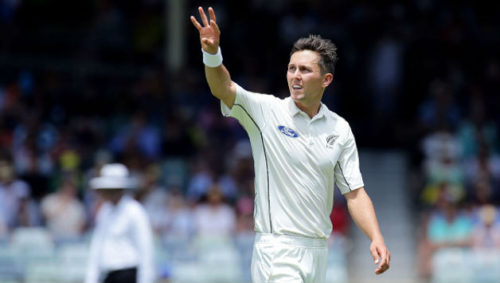
“Just give me one that swings thanks Kane, and we’re going to No. 1.”
There’s something you can see right now that hasn’t been seen for thirty years. It’s not a rare comet: it’s an official Test cricket rankings that has New Zealand higher than Australia. It might come down to decimal points – both teams are on 97 overall ratings points – but the Black Caps are in fourth, the Baggy Greens in fifth. Do the Black Caps deserve to be considered a better Test side than Australia? This article has a look.
We will comparatively examine the relative strengths of either nation in the positions of established opener, junior opener, No. 3, No. 4, No. 5, allrounder, wicketkeeper, first seamer, second seamer, third seamer and spinner.
This article will compare them at all positions, championship boxing style, with an advantage in one of these positions worth a one point win and a knockdown advantage worth a two point win, to be judged along eleven rounds.
Established opener:Tom Latham vs. David Warner
On the briefest glance, this looks like a hands-down win for Warner. He boasts a Test batting average of 47.94, with 20 centuries, compared to Latham’s Test average of 38.84 with six centuries. Warner’s overall average, however, masks the stats of a home track bully.
Although Warner has a considerably higher average than Tom Latham, the two players have a similar average when batting away from home: Warner averages 36.81 away compared to Latham’s 38.46. This is the reason for Warner’s reputation as a home track bully – Latham averages about the same at home as away but Warner averages 59.12 at home.
In all, you’d probably have to give this one to Warner on the basis that he is more likely to play an innings of matchwinning destructiveness once in than Latham is, and that Latham is yet to play a definitively excellent innings against a top-flight team yet.
New Zealand 9, Australia 10
Junior opener: Jeet Raval vs. Matt Renshaw
Jeet Raval is a batsman in the style of Mark Richardson, and in a seven-Test career has functioned an average of 44, the same as Richardson. An average of 44 for a second-choice opener is incredible by recent Black Caps standards, and if Raval can keep his concentration and stick to his simple, AK-47esque simple brutality, he could be excellent in the future.
Matt Renshaw is even less established. He does have one Test century, which Raval has yet to manage, and it’s a big one: a 184 against a visiting Pakistani side this January. Apart from that, he’s not shown too much, maintaining a decent but unremarkable average of 36.64 from ten matches.
This one might be marginal, but it’s still New Zealand’s.
New Zealand 10, Australia 9
No. 3:Kane Williamson vs. Steve Smith
Steve Smith is currently at the top of the Test batting rankings, and there’s few who could really dispute that based on the numbers. He sits at 936 ranking points right now, befitting his stratospheric average of 59.66.
Unlike the days of Ricky Ponting, however, New Zealand boasts a No. 3 in the same league. Kane Williamson is not far behind Smith on the ICC rankings, at 880. Coming off a series in which he scored two hundreds in three matches against the excellent South African attack, Williamson can lay claim to being at least a pretender to Smith’s throne.
Smith is almost universally regarded as superior but here’s a curious statistic: since the start of 2015, Williamson averages 68.37 compared to Smith’s 67.79. Smith has certainly accomplished more in this time frame, but that’s primarily because he has played 15 more innings than Williamson has.
Smith has scored centuries at a marginally higher rate than Williamson during this time: 13 of them from 56 innings for a 23.2% chance per innings. Williamson has scored 9 centuries in 15 fewer opportunities than Smith, which works out to a 21.9% chance.
So in terms of who’s better right now or in the immediate future, on balance it goes to Smith but only by a whisker.
New Zealand 9, Australia 10
No. 4:Ross Taylor vs. Peter Handscomb
Over the last three years, Taylor has averaged 51.21 with the bat. That’s good enough to see him ranked 14th in the world, ahead of Tamim Iqbal, Dean Elgar and Faf du Plessis. He’s been a world-class presence at No. 4 for the Black Caps for many years, and is one behind Williamson and Martin Crowe on the all-time New Zealand Test century scorers table.
Handscomb has only played in 10 Tests, and cannot really be considered an established player. He has a 50+ average, which is very good for ten Tests, but his First Class average of 41 suggests that this will come down a fair bit.
If you consider that Ross Taylor scored the highest ever Test score by a visiting batsman to Australia – 290 in Perth – this is a knockdown win to the Black Caps.
New Zealand 10, Australia 8
No. 5:Henry Nicholls vs. Sean Marsh/Hilton Cartwright
Henry Nicholls could be considered semi-established at No. 5. He hasn’t been excellent so far in Tests – averaging 31.94 from 21 innings – but in his last series it looked like he had turned a corner. On a pitch and against a bowling attack that Kane Williamson could only manage three runs in two innings against – in the second Test against South Africa – Nicholls came in at 21/3 and played a rearguard 118 to take New Zealand from the brink of obliteration to a semi-competitive total. He’s got the goods, it’s just a question of consistency.
Australia’s choices for No. 5 are yet to show either the goods or consistency. Sean Marsh has been unable to make that spot his – despite averaging 50 there over ten innings, Marsh has scored almost everything at home, and Hilton Cartwright, heralded by many on account of his First Class average of over 50, is yet to establish himself here (or anywhere).
This one seems like New Zealand’s as well, thanks to Nicholls’s 2017 average of 48.66. This ultimately suggests that the Black Caps batting is better than the Baggy Greens batting overall. This may be the first time this has ever been true.
New Zealand 10, Australia 9
Allrounder:Colin de Grandhomme vs. Glenn Maxwell
Lord Colin de Grandhomme is now officially considered the Black Caps’ premier allrounder. In six Test matches he is yet to play a really good innings with the bat, but has on several occasions had an important impact with the ball. The most notable of these was a 6/41 against Pakistan that won New Zealand a low-scoring shootout.
Maxwell, in comparison, seems like a straight-out gamble that hasn’t paid off. Despite being one of the best pure hitters in any format of the game, he has only managed to pass 50 once in 14 Test innings. Although a batting average in the mid 20s compares favourably with what de Grandhomme has hitherto achieved, his bowling returns of 8 wickets @ 42 are much poorer than de Grandhomme’s 16 wickets @ 25.
This one goes to de Grandhomme on the basis of his bowling being considerably better.
New Zealand 10, Australia 9
Wicketkeeper:BJ Watling vs. Matthew Wade
Since the start of 2015, BJ Watling has not only given excellent service with the gloves but has scored over 1,200 runs at 42.56, with three centuries. In this regard he has been world-class for the Black Caps and probably the fourth name on the team sheet after Williamson, Taylor and Trent Boult.
Matthew Wade, by contrast, has struggled to dominate in the role and could be said to be picked by default. Over his last 10 matches he has averaged 20 with the bat and so this is fairly another knockdown victory to the Black Caps.
New Zealand 10, Australia 8
Right-arm seamer:Tim Southee vs. Josh Hazlewood
Since the start of 2015, Josh Hazlewood has taken 109 wickets @ 25, cementing him as one of the world’s premier Test bowlers. Only Jimmy Anderson is ahead of him of seamers on current rankings, and it’s easy to see how Hazlewood’s mean accuracy and unpredictable bounce has him at the top here.
By every measure, this is a long way ahead of what Tim Southee has achieved. Southee has 70 wickets @ 34 since the start of 2015, with the only truly matchwinning performance a six-wicket bag to destroy Pakistan’s first innings in Hamilton in 2016.
Southee, even with all his experience, is a much weaker bowler than Hazlewood and Hazlewood is still improving so this would have to go down as a knockdown victory to Australia.
New Zealand 8, Australia 10
Left-arm seamer:Trent Boult vs. Mitchell Starc
Mitchell Starc and Trent Boult have a similar career bowling average of about 28 runs per wicket. Starc has, however, been much stronger over the past 3 years. Since the start of 2015 he has taken 103 wickets at under 25 per wicket.
Boult has still been very good, with 84 wickets @ 30, wrecking England twice, Australia once and South Africa once during that time. One also gets the feeling that he has been unlucky recently, with long periods of sustained pressure inexplicably not ending with wickets.
In the end, though, Starc has a legitimate claim to world-class status whereas Boult is probably at the level below still.
New Zealand 9, Australia 10
Third seamer:Neil Wagner vs. Pat Cummins
Neil Wagner is the highest-ranked Black Caps Test bowler at 10th place. It’s easy to see why – since the start of 2015 he has taken 72 wickets at 24.41, with a sub-50 strike rate. Unlike his teammates Boult and Southee, Wagner doesn’t need as much assistance from the conditions to be effective, and he’s a genuine weapon anywhere.
Pat Cummins is an excellent bowler, but it’s not clear that we’ve seen enough of him to argue that he’s better than Wagner. He came back to the Test arena this year after six years of injury-enforced layoff, and he looked good in taking 14 wickets at just under 30.
Perhaps in five years Cummins will be decisively ahead on this count, but for now Wagner has much more proven effectiveness.
New Zealand 10, Australia 9
Spinner:Mitchell Santner vs. Nathan Lyon
This one is interesting because Santner is clearly the better batsman and Lyon clearly the more effective bowler, it’s just a matter of how to split the balance.
Lyon averages 28.73 with the ball since the start of 2015, with 135 wickets and a couple of Man of the Match efforts in there. This is only three runs per wicket more than Shane Warne averaged, but in a more batter-friendly era. Santner, by contrast, averages just under 40 with the ball and has only claimed 31 wickets so far.
Santner does however average 26 with the bat. Lyon, by contrast, is a genuine tail-ender, with a high score of 40 from 69 Tests and an average of 11.
In the end, you have to say that bowlers are there to bowl, not to bat, and so Lyon’s advantage here ought to be decisive in his favour.
New Zealand 9, Australia 10
Summary: New Zealand 104, Australia 102
Even if it’s agreed, on the basis of the above analysis, that the Black Caps are stronger at Tests than the Baggy Greens, the margin is extremely slim. The Black Caps might be genuinely stronger with the bat, for the first time in the history of Test cricket, but both of the Australian opening bowlers are stronger than their Kiwi counterparts and so is their spinner.
In the Australians’ favour it could be argued that good bowlers are more important than good batsmen and so the difference between Hazlewood and Southee ought to weigh heavier than the difference between Taylor and Handscomb.
If the two sides would play each other on neutral soil in a Test match now there might be a slight advantage to the Black Caps. That there might be a slight advantage is the most you can really say.
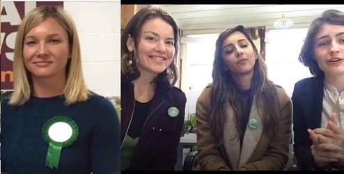
The Green Party has, by far, the best looking women, but that couldn’t prevent their party vote from collapsing at the 2017 General Election
The Green Party vote collapsed at the 2017 General Election compared to 2014. They got 10.7% of the total party vote in 2014, but could only manage 5.9% in 2017 (although this may rise slightly on specials). This article looks at who abandoned them over the three years from 2014.
The largest, most immediate clue is that the average Green voter was much poorer this year than they were in 2014. The correlation between median personal income and voting Green in 2017 was 0.03, compared to 0.31 in 2014. This means that, from being about as wealthy as the average ACT voter, the average Green voter is now about as wealthy as the average Kiwi.
If we look at educational achievement and voting Green, there is evidence that the Greens were completely abandoned by the university-educated crowd.
The correlation between voting Green in 2017 and having a Bachelor’s degree was -0.09, with having an Honours degree it was -0.08, with having a Master’s degree it was -0.09 and with having a doctorate it was -0.08. These figures represent a drastic reversal of the strong positive correlations between voting Green in 2014 and having a Bachelor’s degree (0.57), an Honours degree (0.75), a Master’s degree (0.64) or a doctorate (0.67).
A further strong clue comes from looking at the voting patterns of professionals. Working as a professional and voting Green in 2014 had a very strong correlation of 0.73, but by 2017 this had collapsed, to -0.10. There was a corresponding collapse in the correlations between working in professional, scientific or technical services and voting Green – from 0.63 in 2014 to -0.09 in 2017.
The other interesting change was that the Greens won a lot more working class Pacific Islander support than previously.
The correlation between being Maori and voting Green was virtually the same in 2017 (-0.08) as what it had been in 2014 (-0.09). However, the correlation between being a Pacific Islander and voting Green went from a significantly negative -0.27 in 2014 to an almost uncorrelated -0.07 in 2017.
It’s possible that the Greens won a lot of sympathy from working-class brown voters in the wake of middle New Zealand ripping into Metiria Turei during her WINZ scandal, but that the Maori half of those voters preferred Labour in the final analysis.
Essentially what these numbers suggest is that the Greens hemorrhaged the support of the professional class to TOP, but won the support of a fair number of working class Pacific Islanders who probably felt sympathy with Metiria Turei during her trial and execution by the mainstream media machine.
This explains how the Greens suddenly became a much more Christian party than they used to be. When they still got the support of the mostly atheist professional class, in 2014, the correlation between being Christian and voting Green was -0.57. In 2017, after being abandoned by this professional class and welcomed by working-class Pacific Islanders, who are frequently religious, the correlation between being Christian and voting Green had actually become positive, at 0.21.
That many of these new Green voters were Pacific Islanders can also be seen from the fact that industries with a high Pacific Islander workforce component tended to switch to them. The correlation between working in the postal, transport and warehousing industry and voting Green became markedly less negative, from -0.29 in 2014 to -0.01 in 2017, and there was a complete flip in the correlation between working in manufacturing and voting Green, from -0.49 in 2014 to 0.23 in 2017.
It could be that the Greens lost much of their forward-thinking professional class to TOP but, in doing so, flattened out their bias towards the wealthy and the educated and became more of a mass socialist party that found a voice among those at the bottom.
This theory is supported by the voting patterns of age in the 2017 election. In 2014, the correlation between voting Green and being aged 20-29 was strong, at 0.56. By 2017 it had fallen to -0.05. This collapse was the most brutal suffered by the Greens from 2014, and represents their total abandonment by the most trendy and fashionable segment of society.
Tellingly, the correlation between being aged 5-14 and voting Green increased sharply, from -0.42 in 2014 to -0.08 in 2017. Obviously, children cannot vote but this tells us that young adults who were yet to have children (that aspiring professional class) were heavily represented among those who left the Greens after 2014.
Some might be interested to note that the correlation between working for a wage or salary and voting Green dropped from 0.41 in 2014 to 0.10 in 2017. This more than anything shows the extent to which the Greens of 2017 represent the working-class brown family more than they do the professional white childless urban couple.
*
This article is an excerpt from the 2nd Edition of Understanding New Zealand, which Dan McGlashan and VJM Publishing will have ready for sale at the end of October 2017. This will contain statistics calculated according to the official final vote counts and will be freshly updated with data from the 2017 General Election.