
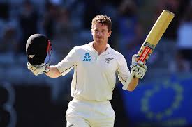
Henry Nicholls is Legitimately Good – Time to Accept It

Hammerin’ Hank Nicholls is inviting comparisons to Andrew Jones with his bulldog tenacity, scoring solid runs despite an ungainly style

Fewer Black Caps players in recent times have come in for more stick than Henry Nicholls. Frequently derided as a passenger, many commentators have been calling for Hesson to get rid of him for good. This article will argue that not only is Nicholls a legitimately good batsman already, but we ought to accept that he’ll be in the Black Caps for a very long time.

Black Caps supporters have been spoiled rotten in recent years. We have Kane Williamson averaging 51, Ross Taylor averaging 47, and a bunch of players like Tom Latham, Jeet Raval and BJ Watling averaging around 40. It’s probably our best ever batting lineup, even surpassing the Wright-Jones-Crowe one of the late 1980s and early 1990s.

It’s so good that we’ve failed to appreciate the quality record that’s slowly being established by our incumbent No. 5, Canterbury’s Henry Nicholls. After 17 Tests, Nicholls has 837 runs at 38.04 – not spectacular on the face of things, but if we look deeper there are some very encouraging trends in those numbers, not least an average of 49.25 over his last ten Tests.

The vast majority of quality international batsmen don’t hit the ground running, as it takes a while to adapt to the top level of the game. Let’s contrast Nicholls’s returns after 17 Tests to the great Kiwi batsmen: Kane Williamson, Ross Taylor, Martin Crowe et al. After 17 Tests, Williamson averaged a mere 29.80; Crowe 24.88. Taylor did not get thrown in the deep end as young as Williamson and Crowe, but after 17 Tests he was barely ahead of Nicholls, at 39.46.

Tom Latham’s average after 17 Tests was also 39. All this tells us that, even by way of comparison to New Zealand’s best, Nicholls stacks up pretty good. Some might criticise his style, but he’s scoring the runs. Leaving aside the overall numbers, Nicholls has succeeded in playing a number of excellent innings in tough conditions.

His first excellent innings may have been the 116 he scored in the Second Test of South Africa’s 2017 tour to New Zealand. Nicholls came in at 21/3 after the dismissal of Neil Broom and scored a counter-attacking 116. The Black Caps still lost, but Nicholls’s maiden Test century came against incredibly skilled bowling that had already done early damage.

Less heralded is Nicholls’s 76 in this Test against South Africa in South Africa. The Black Caps lost heavily – the reason why Nicholls’s effort is not feted – but it would have been a humiliating loss were it not for the 76 he scored in the Black Caps’ second innings, coming in at 7/4 after Williamson had edged a cut to slip. 76 runs might not be many, but coming in on a tricky wicket against superb bowling when his team’s top order had been obliterated, it was an innings of exquisite skill.

The crowning work was of course this week’s 145* against James Anderson and Stuart Broad, on a pitch where England had been dismissed for 58 and no other batsman had passed 33 aside from Kane Williamson. Anderson came into the match as the world’s No. 1 Test bowler and with conditions expected to suit him, but neither he nor Stuart Broad succeeded in dismissing the Black Caps No. 5.

If one considers these innings in tough conditions alongside Nicholls’s generally excellent shot selection, it seems like he has all the tools, including the most important one – the right mind for the game. His numbers might not be outstanding, and no-one’s claiming that he’s going to be another Williamson, but if he keeps improving at this rate he could fashion an excellent career.

It’s time for Black Caps fans to accept that Henry Nicholls belongs alongside Williamson, Taylor, Latham and BJ Watling as an established batsman in this Black Caps Test side.

*

If you enjoyed reading this essay, you can get a compilation of the Best VJMP Essays and Articles of 2017 from Amazon for Kindle or Amazon for CreateSpace (for international readers), or TradeMe (for Kiwis).
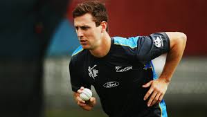

Tim Southee, Mike Hesson and the Sunk Cost Fallacy

Matt Henry has a better ODI strike rate with the ball than even Shane Bond, but can’t make the current Black Caps ODI side over players with much worse numbers

A sunk cost is an economic concept that refers to an expense that has been already paid for, so that this expense is irrecoverable. It sounds unremarkable, but sunk costs do funny things to the human brain. The Sunk Cost Fallacy, and a little game theory, may help explain why Mike Hesson refuses to make the hard call and drop Tim Southee for Matt Henry in the Black Caps ODI playing XI.

The Sunk Cost Fallacy is an example of a reasoning error that is commonly made when sunk costs are involved. It refers to when people do something irrational because they have sunk costs (in the form of money, time or energy) into a line of reasoning already.

The common example given is the Concorde project, during which the French and British governments realised that the project would never make economic sense, but which they continued with anyway on the grounds that they didn’t want to waste their sunk cost.

This is a well-known phenomenon in economics because it often leads to horrific waste, particularly when people throw good money after bad in the hope that their initial investment will be recouped (it’s also a well-known phenomenon in poker when players go broke). As far as Mike Hesson is concerned, the same psychological process may be occurring with his obstinate refusal to elevate Matt Henry to the opening bowler’s position alongside Trent Boult.

Southee is only 29 years old, but he has been playing for ages. He debuted as a teenager, and looked incredibly promising with a five-wicket haul and a run-a-ball 77 in a Test against England. Since then, New Zealand Cricket have invested substantial resources in him, giving him every opportunity to take the new ball against all comers. No less an authority than Allen Donald touted Southee as potentially a great swing bowler, but it’s hard to deny the raw numbers.

The numbers argue confidently that Southee is not as good as Henry (in ODIs at least), and probably never has been.

Since the loss to Australia in the final of the 2015 Cricket World Cup, Southee has averaged 42.77 with the ball. He has taken 45 wickets in this time frame at an economy rate of 5.72. Henry has taken 44 wickets at an economy rate of 5.81, which is similar, but has an average of 28.13 thanks to a strike rate of 29.

This is, amazingly, a better strike rate than Shane Bond managed over his career (29.2), and means that Henry has been 50% more likely to take a wicket on any given ball than Southee during this time.

Southee is striking at 44.8 since the last Cricket World Cup, and has not taken four wickets in an innings since then, despite playing in 38 games. Henry has only played in 25 matches since the final loss but has already managed three four-wicket bags and one five-wicket bag in that time – only one of each fewer than Southee has managed in a 132-match career.

In fact, Southee has not managed to get four wickets in an innings one time in the last three years, whereas Henry took four wickets in his last match.

Mike Hesson might be thinking here in terms of potential, in that, theoretically, Southee has the potential to be another Jimmy Anderson. Like Southee, Anderson is also tall, bowls with an open stance and relies on swinging the ball to nick batsmen out. Also like Southee, the Englishman didn’t achieve anything particularly special in his first 132 ODIs, returning an average of 30.18 for his 179 wickets.

But in 43 matches since the start of 2012, Anderson has taken 65 wickets at an average of 23.97. Hesson might be expecting a similar transformation to come over Southee, but it’s also very possible that he has invested so much time and energy in Southee that he sees this investment as a sunk cost that he is compelled to recoup.

A solution that would save everyone’s face would be to demote Southee to third seamer. This would be the best of all worlds for everyone except for Lockie Ferguson, who would then struggle for a starting berth.

The positives are that it would allow Boult and Henry, with the best strike rates, to bowl with the new ball when they are the most effective, and it would allow Southee to utilise his skill set of varied deliveries at the death while minimising his weaknesses of being slow and inaccurate. Southee also has 33 wickets as third seamer, averaging an entirely acceptable 28.18 (compared to over 35 while opening). It seems like a solution whose time has come.

*

If you enjoyed reading this essay, you can get a compilation of the Best VJMP Essays and Articles of 2017 from Amazon for Kindle or Amazon for CreateSpace (for international readers), or TradeMe (for Kiwis).
Understanding New Zealand: Turnout Rate in 2017

The turnout rate in the 2014 General Election was 77.9%, and at the time of the 2017 General Election this had climbed to 79.3%. This is not a huge change, but care must be taken not to be misled. Just because the overall turnout rate was about the same does not mean that the turnout rates of the various demographics within New Zealand society all remained the same. This article examines the deeper trends.

The most striking thing about the turnout rates in the 2017 General Election is that, despite the alarm about the huge numbers of immigrants New Zealand has absorbed in recent years, the election marked a sharp increase in turnout rate among the New Zealand-born.

The correlation between being New Zealand-born and turnout rate became much more positive from 2014 to 2017, from a significantly negative -0.24 to -0.10. This is arguably the story of the election and explains how we ended up with a nationalist party holding the balance of power.

Among the four major parties, the correlation with turnout rate and voting for a particular party remained very similar from 2014 to 2017 for National (0.76 to 0.75), Labour (-0.70 to -0.72) and the Greens (0.28 to 0.27). These slight falls were balanced by a fairly strong increase for New Zealand First (-0.09 to -0.02).

This doesn’t necessarily mean that there was a swing towards New Zealand First – it just means that the sort of person who is a New Zealand First supporter was more likely to vote this time around. Who they actually voted for requires further analysis.

If we look at the ethnic demographics, we can see that the correlation between being of a certain race and turnout rate between 2014 and 2017 strengthened for Kiwis of European descent (from 0.71 to 0.81) and for Maoris (from -0.75 to -0.68). These are the two ethnic groups most likely to support New Zealand First.

Pacific Islanders and Asians, who were more likely to be born overseas, were less likely to turn out to vote. The correlation between being a Pacific Islander and turnout rate was -0.58 in 2017, out from -0.44 in 2014, which makes them now almost as disenfranchised as Maoris. The correlation between being Asian and turnout rate was -0.22 in 2017, out from -0.10.

One reason for this is that even though large numbers of immigrants have turned up in New Zealand recently, many of these newcomers don’t seem to feel much of a connection with the country and so are not motivated to vote.

Where it gets complicated is that the correlation between median age and turnout rate increased from 2014 to 2017, from 0.77 to 0.79. This means that the people who voted this time around were older, and older people tend to vote National – but these voters did not vote National.

The correlation between being aged 20-29 and turnout rate became a lot more negative from 2014 to 2017, from -0.21 to -0.26. The correlation between being aged 30-49 and turnout rate followed a similar pattern, weakening from 0.21 to 0.13. The predictable result of this is older people voting more, and indeed we can see that the correlation between being aged 50-64 and turnout rate increased from 0.70 in 2014 to 0.73 in 2017, while the correlation between being aged 65+ and turnout rate increased from 0.64 in 2014 to 0.67 in 2017.

Unsurprisingly, then, the correlation between being on the pension and turnout rate increased from 2014 to 2017 (from 0.50 to 0.56). In fact, all of the benefit types apart from the student allowance also strengthened. The correlation between being on the invalid’s benefit and turnout rate strengthened from -0.53 in 2014 to -0.43 in 2017, and the correlation between being on the unemployment benefit and turnout rate strengthened from -0.76 in 2014 to -0.72 in 2017.

This is supported by the fact that voters were more likely to be New Zealand-born in 2017, because there is a significant correlation between being New Zealand-born and being on a benefit.

More information comes from noting that several correlations between belonging to privileged demographic categories and turnout rate decreased from 2014 to 2017. This applied to people working in information media and telecommunications (0.06 to -0.01), financial and insurance services (0.08 to 0.01) and professional and scientific services (0.28 to 0.23). Also, the correlation between having never smoked tobacco and turnout rate fell from 0.35 in 2014 to 0.25 in 2017.

On the other hand, the correlations between more working-class occupations and turnout rate increased, most strikingly so in the occupations that involved the most personal contact. The correlation between working in a particular occupation and turnout rate increased from 2014 to 2017 in the case of education and training (-0.10 to -0.03), healthcare and social assistance (-0.04 to 0.05), arts and recreation services (0.04 to 0.09) and hospitality (-0.09 to -0.01).

A poorer cross-section of the population turned out to vote in 2017, which is another clue as to where Labour won. All of the correlations between being in an income band below $70K and turnout rate strengthened from 2014 to 2017, and all of the correlations between being in an income band above $100K and turnout rate weakened from 2014 to 2017. The correlation between being in the $70-100K income bracket and turnout rate remained exactly the same, at 0.38.

Another striking correlation is that between being part-time employed and turnout rate, which rose sharply from 0.45 to 0.58 between 2014 and 2017. This, coupled with what we know about income brackets and turnout rate, suggests that it was the people on the margins between doing well and doing poorly who shifted from National to Labour. It may be that these people saw the promise of the country being lost, or felt that they missed out on all the loot of the last nine years.

Perhaps the clearest sign of where National lost the election comes from the correlations with the flag referendum. The correlation between voting National in 2017 and voting to change the flag in the second flag referendum was an extremely strong 0.93, which tells us that it was pretty much only National voters to wanted to change the flag to the National Party version.

These National Party supporters, being generally well enfranchised, have very high turnout rates. The correlation between turnout rate in 2014 and voting to change the flag was 0.75, exactly the same as the one between turnout rate in 2017 and voting to change the flag. However, the correlation between turnout rate in the second flag referendum and turnout rate in the general election increased from 2014 (0.86) to 2017 (0.92).

This suggests that many of the new people who voted in the 2017 General Election but did not vote in the 2014 one were Labour supporters who came from generally National-supporting demographics (i.e. wealthy but not too wealthy, old but not quite a pensioner, white, employed and part-time employed, male). Had they been National supporters, the correlation between turnout rate and voting to change the flag would have increased from 2014 to 2017, because the vast bulk of people who wanted to change the flag were National supporters.

We can say that it was here that the centre, and thereby the 2017 General Election, was lost by the National Party.

*

The second edition of Understanding New Zealand, by Dan McGlashan, was published by VJM Publishing in the summer of 2017/18. It contains all the analysis of Kiwi voting patterns and demographics you could ever want!

The 10 Most Uncorrelated Pairs of Things in New Zealand Society

The third part of Dan McGlashan’s Understanding New Zealand contains an index of all the 11,628 correlations considered in the writing of the first two parts of the book. There are so many of these that the index has to go to three decimal places in order to properly distinguish them from each other. Even then, there are some pairs of variables that are so perfectly uncorrelated that they go down to weaker than 0.000 – as this article examines.

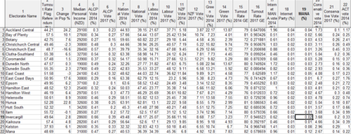
This data was collected from the Electorate Profiles that can be found on the Parliamentary Library website, and then entered into a Statistica database from which a correlation matrix was calculated. These ten pairs of variables represent the least correlated things in New Zealand society.

9=. 0.0007, Voting New Zealand First in 2014 and Being of European descent

New Zealand First gets much more support from Maori electorates than most people realise. Their level of support among Maoris declined in 2017 but in 2014 it was strong enough that there was no correlation between voting New Zealand First and being white.

9=. -0.0007, Voting Internet MANA in 2014 and Having an income between $60-70K

Internet MANA voters were a fair bit poorer than average, and so there is no correlation between voting for them in 2014 and having a slightly higher than average income.

8. -0.0006, Having NZQA Level 2 as a highest academic qualification and Working as a sales worker

Leaving school at the end of Sixth Form is a middling sort of academic achievement, and being a sales worker is an extremely common line of employment.

7. 0.0005, Being a Brethren and Working in public administration and safety

Brethrens are indifferent to working for the Government.

6. -0.0004, Voting Internet Party in 2017 and Being a Spiritualist or New Ager

Internet Party voters are young and mostly live in Auckland; Spiritualists and New Agers are a bit older and are distributed reasonably evenly throughout the country.

3=. 0.0003, Voting to change the flag in the second flag referendum and Being in a couple with children

Couples with children probably have more important things to think about than a flag referendum, which was only ever a vanity project for the elderly elite with leisure time.

3=. -0.0003, Being a Christian (not further defined) and Being a sales worker

Christians, when not further defined, are generally a bit poorer than average, and sales workers are moderately wealthy, hence no correlation.

3=. -0.0003, Being a Pacific Islander and Being on the invalid’s benefit

Pacific Islanders are stereotyped as being on the benefit a lot, but the truth is that the sort of Pacific Islander who wanted to go on the invalid’s benefit probably wouldn’t be motivated to immigrate to New Zealand in the first place.

1=. -0.0001, Voting Internet MANA in 2014 and Taking a bus to work

Internet MANA voters in 2014 tended to live in the Far North, and those who lived in Auckland often took a bus to work, the others not so much.

1=. -0.0001, Being a regular tobacco smoker and Being a sales worker

There are no more middle-of-the-road variables than being a regular tobacco smoker and being a sales worker. Both traits point to a very normal, standard sort of person, hence no correlation.