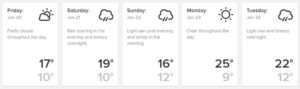
Ranking The New Zealand Political Parties In Order of Kiwiness

This essay is based on a premise that will aggravate some and endear us to others: that Kiwis born in New Zealand are significantly more representative of what constitutes Kiwi culture than Kiwis born outside of New Zealand, and so much so that this factor alone can tell us things about ourselves.

To put it more precisely, the premise is that the higher the correlation between voting for a particular party in the 2014 General Election and being born in New Zealand, and the lower the correlation between that and being born overseas, the better that political party represents New Zealand and Kiwis.

With that defined, here are the political parties of New Zealand, ranked in order of how unlikely it is that a Kiwi born in New Zealand would vote for them. This unlikelihood is expressed as a correlation.

-0.74, ACT: It isn’t really surprising that the Get Rich Quick party has the lowest correlation with being born in New Zealand. The entire point of the ACT Party is essentially to rape the country and then sell it off, not to the highest bidder, but whoever comes up with some cash first.

The ACT Party has a relationship to New Zealand roughly analogous to the relationship a medieval Arab slave trader had to his Nubian slaves. Perhaps the best example of how the ACT Party fails to be Kiwi is that, even in a political environment where the centre-right National Party has completely crushed all opposition, they can’t manage more than one single seat.

-0.36, National: This correlation is fairly similar to that between net personal income and being foreign-born, which suggests that most of the immigrants that we let in on the grounds of being rich vote National.

As for those of us born here, we tend to not like National much because they’re not really the party of the Fair Go. They’re more like the party that charges First World prices while paying Third World wages. They don’t have quite the lowest correlation though because there’s something Kiwi about capitalist exploitation, as we are, after all, children of the Empire.

-0.22, Conservative: There is something mildly Kiwi about a party that just won’t give up in the face of insurmountable odds. Especially when that party is led by a weirdly creepy fundamentalist Christian fellow who sets off all kinds of sexual predator alarm bells in the heads of those watching him talk.

There is a well-established conspiracy theory that the British dumped their sexual deviants in New Zealand in the same way they dumped their criminals in Aussie. If there is any basis at all to this sort of thing then the Conservative Party are perhaps a natural long-term manifestation of this policy.

-0.01, Green: The Greens are a mixed bag. In some ways they represent the very best of us, and in others the very worst. In so far they represent the best of us, the professional, scientific and technical class – those with the best understanding of the systems we rely on to support ourselves and the challenges facing their sustainability – tend to vote Green.

In so far they represent the worst, there is no party more puffed-up and self-righteous, and supporters of no other party are as likely to hate you for disagreeing with them. In that manner the Greens represent the kind of of arrogant elitism that has used New Zealand as a social psychology laboratory for over a century.

It’s easy to imagine that the Greens might want to bring in ten million refugees in one hit and make it a criminal offence to raise public opposition to the idea. Which is exceptionally unkiwi.

0.01, Labour: Labour are basically the same as the Greens, and for similar reasons. This is why the strength of the correlation between voting Labour and being born in New Zealand is essentially nil.

The Maoris, who have the highest positive correlation with being born in New Zealand, are likely to vote Labour, as are the Pacific Islanders, who have a negative correlation with being born here. European Kiwis, who tend to vote National, counterbalance the immigrant Europeans who tend to vote Green.

All in all, the Labour Party is a big mess of confusion about which little can be accurately said.

0.54, Internet MANA: Perhaps fittingly, the next three parties on the list are all led by Maoris. Hone Harawira, whose family name is deeply entwined with the entire New Zealand power structure, was the public face of this abomination.

However, a party funded by a big fat criminal from Germany has an upper limit on how Kiwi it can ever be, and despite Hone’s best efforts Internet MANA tops out at 0.54.

0.62, Maori Party: Blundering mindlessly forward into your own destruction despite both obvious signs that the path forward is suicide and many chances to turn back is quintessentially Kiwi (this is essentially the spirit of Anzac).

So when the Maori Party stakes the entirely of its political capital on a hamfisted attempt to “help” Maori people by taxing them into the local Mental Health Unit on account of them using tobacco, it’s perfectly representative of them to double down and to keep increasing the taxes despite repeated warnings from academic researchers that it is counterproductive.

0.69, New Zealand First: Maybe no-one should be surprised that New Zealand First has come in second place in this study. After all, they are called New Zealand First, as opposed to Global Banking Interests First (as National should be called) or The United Nations First (as Labour and the Greens could combine as).

Being led by a Maori who doesn’t know if he’s left wing or right wing and who is a little bit shy about even identifying as Maori in the first place is like a Kiwi caricature.

And that leaves us with the most Kiwi party of them all, which is…

0.77, Aotearoa Legalise Cannabis Party: The Legalise Cannabis Party represents the best of New Zealand – full of young people, free thinkers and Maoris, these are the kind of people who will not believe any kind of rubbish simply because it is handed down from an authority figure.

Apart from the All Blacks, Vegemite, and being shy about getting naked, cannabis use is the strongest identifier of actual Kiwi culture out of the lot of them. There’s nothing else that brings Kiwis of all classes, races, cultures and occupations together like smoking weed.

If any of this reasoning has failed to convince the reader, just ask yourself: who would Billy T James have voted for?

*

This article is an excerpt from Understanding New Zealand, by Dan McGlashan, the complete guide to the voting and demographic patterns of New Zealanders. First ediction published by VJM Publishing Winter 2017.

Understanding New Zealand: Men and Women

The statistics we have examined so far have gone down into some fine details, but a correlation matrix is also useful for giving us information about high-level categories, such as men and women. What can the elementary gender division tell us about Kiwis?

Some points that stand out are ones that were already fairly well known. Men are slightly wealthier than women – the correlation between being a man and net personal income was 0.23. Also, to continue the general theme of minor social advantage, the correlation between being a man and voting in the 2014 General Election was 0.29.

Perhaps less well known is that men really like the National Party. The correlation between voting National in 2014 and being male was 0.35, which was significant. This was mirrored on the centre-left: the correlation between voting Labour in 2014 and being female was 0.31.

Neither of those statistics is surprising if the reader is aware of the many parallels between masculinity and conservatism, in particular the desire for the maintenance of a relatively high degree of order.

Likewise, there are clear parallels between femininity and social democracy, in particular the desire for a relatively egalitarian distribution of wealth and social status.

There are small, not significant correlations between voting Green and being male (0.10) and between voting New Zealand First and being female (0.21).

Of some interest, women smoke slightly more than men – being female has a correlation of 0.19 with being a regular smoker, although this is not significant. Possibly this reflects the value of nicotine as a treatment for certain anxiety and depression-related mental disorders, which women tend to suffer from at a greater rate than men.

Looking at gender differences in personal income and choice of employment, several interesting patterns reveal themselves.

One is that women are significantly more likely to be on any of the four benefits this study looks at. Although the correlation between being female and being on the pension was not significant (0.03), the others were much greater. Between being female and being on the student allowance the correlation was 0.21, with being on the unemployment benefit it was 0.39, and with being on the invalid’s benefit it was 0.26.

Being male was not significantly correlated with net personal income – the strength of this was 0.23, which was on the boundary of significance. However, looking at the next level down reveals a few patterns.

The personal income band most strongly correlated with being male was the $50-60K band. Here there was a correlation of 0.22. The female equivalent was the $5-10K band. There was a correlation of 0.21 between being female and being in this band.

Despite that males are generally slightly wealthier than females, this is not reflected in either of the $100K+ income bands. In both of these bands there is no correlation with gender.

This suggests a complicated pattern, but the general trend is that the higher the social status of any given line of work, the closer to gender parity the pay will be. This could reflect a lot of things.

Perhaps the most notable clue to answering this question comes from the fact that more men are managers – the correlation between being male and working as a manager was 0.49 – but more women are professionals.

This is an interesting division because it suggests that there is a difference in how men and women get to the highly compensated jobs.

Men are more likely to rise up to the top jobs from a lower starting point, a path not as easy for women because of the demands of childrearing. However, women are more likely to get a good education, valuable skills and therefore a high starting point, from where further advancement is not necessary or desired, or as heavily impacted by taking time off for children (many family GPs are women who fall into this category).

This might explain why there is no gender gap for the top income brackets, but explaining why there is a gender gap for the lower income brackets is a different matter.

Most of the reason is that men, whether by will or fortune, tend to choose industries that pay better than the ones women choose. Being male is significantly correlated with working in agriculture, construction, accommodation, and rental, hiring and real estate services, and these jobs tend to pay better than jobs in education and training and healthcare and social assistance, which correlate significantly with being female.

Perhaps the statistic that all gender warriors will find the least objectionable is that the people in the truly plum industries of professional, scientific and technical services, information media and telecommunications and financial and insurance services have the weakest correlation with being either male or female.

Generally there were no strong correlations between men and women in New Zealand, which one might expect from a generally free and liberal post-industrial secular democracy. The strongest correlation of all in this study was the completely unsurprising one between being female and being a single parent, which was 0.52.

*

This article is an excerpt from Understanding New Zealand, by Dan McGlashan, published by VJM Publishing in the winter of 2017.

Understanding New Zealand: Wealth and Poverty II

If we wish to go deeper than simply calculating correlations between median personal income and various demographic categories, we can take a look at the next level down of the Great Fractal, and examine correlations between income bands and specific industries.

It’s apparent from the numbers that winning working class loyalty is a battle between Labour and New Zealand First.

Labour does the best out of people who have next to nothing at all. The correlation between voting Labour in 2014 and having a net personal income of $5-10K was 0.45, and with having lost money in the year or having nil income the correlation was 0.54.

New Zealand First, by contrast, tended to dominate the lower working class vote. The correlation between voting New Zealand First in 2014 and income was above 0.70 for all of the income bands between $10K and $30K. For both Labour and New Zealand First, however, the correlation between voting for them in 2014 and any income band above $70K was -0.40 or even more strongly negative.

Although Aotearoa Legalise Cannabis Party voters were generally doing worse than average, they were closer to the middle than either Labour or New Zealand First voters. The correlation between voting for them in 2014 and being in the $50-60K income bracket was a significant 0.32, and even for the $150K+ bracket it was -0.31, significantly lower than average but barely so.

The National Party was predictably more oriented towards the middle classes, especially the wealthier ones, although this correlation was not as strong as one might have expected. For all of the income brackets above $70K the correlation with voting National in 2014 was between 0.34 and 0.36, which was significant but not particularly.

National did better than Labour in the $50-60K bracket, which is possibly where the winning of the election was more than anywhere else. After all, this bracket contains the sort of voters who don’t particularly win or lose from higher or lower taxes and so they tend to vote on apparent competence over ideology.

Voting for the National Party in 2014 had a negative correlation with every income band underneath $50K, although the correlations were not significant for the $15-25K income brackets, which were dominated by New Zealand First.

This creates an interesting contrast with the most established other right of centre party, ACT. The ACT party has no extra pull among the young in the $15-25K bracket – all of the income brackets between $10-40K have a correlation of -0.50 or stronger with voting ACT in 2014.

In the $15-25K income bracket there is little difference in the strength of correlation with either the National or the Labour parties. This is probably the result of one or more contradictory trends. Probably there are large numbers of people in this income bracket who, despite being poor, can count on being reasonably wealthy in a few decades, and so vote National in anticipation.

This phenomenon, of a small number of young people voting National because they expect to be wealthy in the future, is evidence of a burgeoning class system in New Zealand.

Winning the loyalty of the middle classes is essentially a battle between National and the Greens.

Voting Green in 2014 has a negative correlation with all income brackets between $10-50K, which will surprise anyone who might have thought the Greens stood for the poor and for those struggling. They have a significant positive correlation with the income band that is full of young students – between voting Green in 2014 and being in the $5-10K bracket is 0.30.

By contrast, voting Green in 2014 has a positive correlation with all income brackets above $50K, which confirms the picture that they represent the liberal urban elite rather than either the rural elite (National), the urban poor (Labour) or the rural poor (New Zealand First).

Perhaps the most interesting division of the middle class is its divide into managers and professionals.

The managers tend to be more right wing – voting National in 2014 has a correlation of 0.56 with being a manager, whereas for being a professional it is a not significant 0.10. The professionals tend to be more liberal – voting Greens in 2014 has a correlation of 0.73 with being a professional, whereas for being a manager it is a not significant 0.08.

*

This article is an excerpt from Understanding New Zealand, by Dan McGlashan, published by VJM Publishing in the winter of 2017.

Understanding New Zealand: Tobacco Users

Interestingly, the Electoral Profiles detail the number of people within each electorate who are regular smokers, who are ex-smokers, and who have never smoked. These stats, when added to the correlation matrix, tell us about the tobacco smoking habits of New Zealanders.

This article will assume that the statistics for tobacco use correlate highly with the statistics for cannabis use. The primary reason for assuming this is the size of the correlation between being a regular tobacco user and voting for the Aotearoa Legalise Cannabis Party in 2014, which was 0.88.

This was the strongest of all the correlations between being a regular smoker and voting for a particular party in 2014. For voting Maori Party the correlation was 0.81, for Internet MANA 0.73, for New Zealand First 0.72 and for Labour 0.53. On the not-currently-smoking side were the Greens at -0.19, Conservative at -0.47, ACT at -0.58, and National at -0.75.

Already from this, some clear trends suggest themselves – in particular, that a Kiwi is more likely to be a regular smoker the harder their life is.

There was a correlation of -0.61 with net personal income and being a regular smoker, which is even stronger than the correlation with net personal income and being Maori (-0.48).

On that point, the correlation between being a regular smoker and being Maori is a whopping 0.92. This is even stronger than the correlation between voting Maori Party and being Maori (0.91), which tells us that the smoking-Maori connection is one of the strongest observations that we can make.

Kiwis of European descent are moderately unlikely to be regular smokers – the correlation between the two is only -0.32 – but the correlation between being of European descent and being an ex-smoker is 0.74. Asians are more likely to never have smoked – the correlation between the two was 0.77.

Although there was no significant correlation between median age and never smoking, the correlation between median age and being a regular smoker was -0.53, and with being an ex-smoker it was 0.53. This tells us that regular smokers tend to be much younger than ex-smokers, which fits the observation that regular smokers are usually in their teens, twenties or thirties.

Returning to the idea that people tend to smoke more the worse they are doing, we can observe that the correlation between being a regular smoker and being on the invalid’s benefit is 0.85, and with being on the unemployment benefit it was a whopping 0.87. This is probably because there is little else to do on a long-term benefit other than to smoke!

Also related to this idea, we can see that people doing well are less likely to smoke. Even merely being a student, which is to say, still young and poor but at least hopeful, is not significantly correlated with being a regular smoker. It is, however, correlated with never smoking, even if it was a very mild 0.25.

Perhaps the final word on this line of thinking comes from contrasting the correlation between having no qualifications and being a regular smoker, which is 0.84, with that of having a Master’s degree and being a regular smoker, which is -0.66.

Predictably, given the stats detailed thus far, the working class professions tend to be the ones that correlate positively with being a regular smoker. Agriculture, fishing and forestry (0.35), Construction (0.37), Electricity, gas, water and waste services (0.42), Transport, postal and warehousing (0.52) and Manufacturing (0.58).

And so, the middle and professional classes are inversely correlated with being a regular smoker. These were Information media and telecommunications (-0.34), Rental, hiring and real estate services (-0.38), Financial and insurance services (-0.48) and Professional, scientific and technical services (-0.56).

Finally, there is no significant correlation between any of being a regular smoker, being an ex-smoker and never having smoked on the one hand, and being either male or female on the other. Despite this, the numbers suggest that more females than males are regular smokers.

*

This article is an excerpt from Understanding New Zealand, by Dan McGlashan, published by VJM Publishing in the winter of 2017.