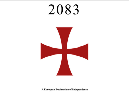
Who Voted for the Ban 1080 Party?

Of all the smaller parties in the 2017 election, the Ban 1080 Party might be the strangest of them. There are other small single-issue parties – the Aotearoa Legalise Cannabis Party being foremost of these – but even these other parties have equivalents overseas. Who are the Ban 1080 Party, and what do we know about their 3,005 voters?

The Ban 1080 Party website argues for the need to stop making aerial poison drops that use sodium monofluoroacetate (1080) in New Zealand’s national parks and forests. The website’s tagline is “Protect our native birds” and they believe that aerial 1080 drops are a risk to the wellbeing of New Zealand’s birdlife.

A strong South Island focus was evident from the correlation matrix – the correlation between voting Ban 1080 Party in 2017 and living on the South Island was 0.37. The reason for this is probably because a greater proportion of South Islanders will live in the vicinity of a national park or a forest than North Islanders, who are much more urban on the whole, and it’s these people who access the outdoors who are most concerned about things like aerial poison drops.

This explain why the Ban 1080 Party also correlates strongly with other demographics that are well-represented on the South Island. The correlations between voting Ban 1080 in 2017 and other demographic categories were 0.34 for being a Kiwi of European descent, and 0.22 with median age. The only age bracket with a significant positive correlation with voting for the Ban 1080 Party was the 50-64 age bracket – the correlation here was 0.38.

If we examine measures of class we can see that Ban 1080 Party voters are poorer and less educated than the national average, which is especially striking if one considers that they otherwise belong to demographics that are positively correlated with wealth.

The correlation between voting Ban 1080 Party in 2017 and median personal income was -0.23, and the correlation between voting Ban 1080 Party in 2017 and having no NZQA qualifications was 0.44. Related to this is a correlation of 0.30 between voting Ban 1080 Party in 2017 and being a regular tobacco smoker. This paints a picture of a section of the community who are relatively simple people and who perhaps have been taken in by the hysteria a bit.

The rural nature of Ban 1080 Party voters is demonstrated starkly when it comes to the correlations between voting for them in 2017 and working in the agriculture, fishing and forestry (0.67) or mining (0.69) industries. There was also a significant positive correlation of 0.35 between voting for Ban 1080 Party in 2017 and working in the hospitality industry.

These three correlations reflect the high proportion of Ban 1080 Party voters who were enrolled in either the West Coast-Tasman or Clutha-Southland electorates.

Underlying that Ban 1080 Party voters are comprised of the outdoorsy kind of person who spends a lot of time in national parks and forests, there are significant positive correlations between voting Ban 1080 Party in 2017 and both being born in New Zealand (0.46) and being male (0.35).

Ironically, given their heavy conservation focus, the Ban 1080 Party does not attract followers who are like the Green followers. The correlation between voting Ban 1080 Party in 2017 and voting Green in 2017 was -0.09.

People who voted Ban 1080 Party tended to overlap with those who voted New Zealand First and, oddly, Aotearoa Legalise Cannabis Party. Voting for the Ban 1080 Party in 2017 had a positive correlation with voting for either of these parties: 0.41 for New Zealand First and 0.28 for the ALCP.

Part of the reason for this is the high level of Maori support for the party. This might sound contradictory, given that most Maoris live on the North Island, but a couple of statistics make this association clear. The first is the correlation between voting Ban 1080 Party and being Maori, which was 0.16, and the correlation between living on the South Island and being Maori, which was -0.26.

This tells us that South Island Maori were proportionately big supporters of the Ban 1080 Party, which is fitting considering that this demographic is extremely active in the outdoors with hunting and food gathering.

Who Voted New Zealand First in 2017

New Zealand First voters are generally drawn from the hard-done-by segments of the population

A previous article in this column examined the differences between New Zealand First voters and the voters of both National and Labour. It turns out that New Zealand First is almost equidistant from the two major parties if measured demographically. This article, however, looks more closely at who voted for New Zealand First in particular.

Despite being considerably whiter than it was in 2014, New Zealand First is not a particularly white party. In 2014 there was a correlation of 0.00 between voting New Zealand First and being a Kiwi of European descent. By 2017 this had climbed to 0.21, which was still not significant.

The strongest correlation between being of a particular ethnicity and voting New Zealand First was with being Maori, which was 0.38. The correlations between voting New Zealand First in 2017 and being a Pacific Islander (-0.21) or being Asian (-0.52) were much more negative.

Tellingly, for a nationalist party, their strongest support was from Maoris, who have the strongest roots in the country as essentially none of them are immigrants. Their next strongest level of support was from Kiwis of European descent, who have the second-deepest roots in the country, and their weakest level of support was from Asians, who have the shallowest.

As in 2014, New Zealand First voters in 2017 were some of the least educated out of any voting bloc. The correlation between having no NZQA qualifications and voting New Zealand First in 2017 was 0.67, and the correlation between having a doctorate and voting New Zealand First in 2017 was -0.60. This tells us that New Zealand First voters are decidedly working-class.

True to stereotype, there was a strong positive correlation of 0.58 between voting New Zealand First in 2017 and being on the pension, but there was also a strong positive correlation of 0.47 between voting New Zealand First in 2017 and being on the invalid’s benefit.

All of this suggests that the easy story of New Zealand First being an old racist’s party is somewhat misguided – it’s true that they do get many votes from poorly educated old white people, but that’s more because New Zealand First gets a lot of votes from hard-done-by people in general and poorly educated old people tend to be limited to their pension and therefore hard-done-by.

Gareth Morgan’s personal antipathy towards Winston Peters was reflected in the correlation of -0.31 between voting The Opportunities Party in 2017 and voting New Zealand First in 2017. This put TOP in a band with United Future (-0.27), ACT (-0.34) and the Greens (-0.48) as parties whose voters did not correlate highly in a general demographic sense with the voters of New Zealand First.

All four of those parties are particularly Pakeha-heavy parties, and ACT, the Greens and TOP appealed heavily both to young and educated people. So there is plenty of reason for these reasonably strong negative correlations.

There were positive correlations between voting New Zealand First in 2017 and voting for any of the Maori-heavy parties in 2017. These were Maori Party (0.11), MANA (0.24) and Aotearoa Legalise Cannabis Party (0.40).

Many will be surprised that there is a moderately strong positive correlation between voting New Zealand First in 2017 and voting Conservative Party in 2017 – this was 0.38. The reason for this is that both parties appeal to the large faction of poorly-educated old white voters mentioned above.

Despite the shared appeal to old white people, however, the correlation between voting National in 2017 and voting New Zealand First in 2017 was only 0.04, far from being significant. The reason for this is the class difference – the National Party appeals to people who are doing well economically (and most of these people are old), whereas New Zealand First appeals to people at the bottom of the ladder (and poor old people with no realistic way of becoming wealthier are definitely near the bottom).

*

This article is an excerpt from the 2nd Edition of Understanding New Zealand, which Dan McGlashan and VJM Publishing will have ready for sale at the end of October 2017. This will contain statistics calculated according to the official final vote counts and will be freshly updated with data from the 2017 General Election.

Who Voted Greens in 2017

The Green Party tore itself to pieces during this year’s electoral campaign, but a hard core of voters stayed with the party

The Green Party vote collapsed from 2014, as a previous article has examined, with much of it going to The Opportunities Party. Although the special votes helped them out since the time that linked article was written, they still fell to 6.27% in 2017 from 10.70% in 2014. This article looks at who voted for them.

The major curiosity about the Greens and their movement is that, although they are on the left, they are comprised of people who do not immediately benefit from increased resource distribution (i.e. the wealthy). The correlation between voting Greens in 2017 and median personal income was 0.36, which was up from 0.31 in 2014, and not a whole lot weaker than the correlation of 0.49 between median personal income and voting National in 2017.

All of the correlations between voting Green and being in one of the income bands below $70K were weak no matter if they were positive or negative. But above this point, the correlations were strong. Between voting Green in 2017 and earning $70-100K the correlation was 0.49, with earning $100-150K it was 0.56, and with earning $150K+ it was 0.51.

However, much like 2014, the average Green voter in 2017 was a bit younger than the average Kiwi. The correlation between voting Green in 2017 and median age was -0.18. This is mostly because of a very strong correlation of 0.60 between being aged 20-29 and voting Green in 2017.

The Greens lost ground with Kiwis of European descent. By 2017 the correlation between voting Green and being a Kiwi of European descent was 0.17, down from 0.24 in 2014, which meant that although it was still positive it was no longer significantly so. They also lost ground with Maoris. The correlation between being Maori and voting Green was -0.09 in 2014 but -0.14 by 2017.

By 2014, the Greens were already much better educated than the average Kiwi, and by 2017 this distinction had only strengthened. The correlation between voting Green in 2017 and having a university degree was 0.64 for having a Bachelor’s, 0.81 for having an Honours, 0.71 for having a Master’s and 0.68 for having a doctorate. This higher general education explains why Green voters can be above average in income despite being below average in age.

The Greens maintained their core, urban elite vote despite the losses from 2014, and this is evident from looking at the voting patterns of certain industries. The correlation between voting Green and working in information media and telecommunications was 0.75, with working in professional and scientific services it was 0.70, and with working in arts and recreation services it was 0.69. All three of those correlations were as strong or stronger in 2017 than they were in 2014.

Things were much different for voters in working-class industries. In 2017 the negative correlations between voting Green and working in a particular industry included -0.02 in retail trade (down from 0.09), -0.20 in construction (down from -0.09), -0.29 in agriculture, forestry and fishing (down from -0.24), -0.32 in transport, postal and warehousing (down from -0.29) and -0.56 in manufacturing (down from 0.49).

A couple of correlations that Green Party thinkers won’t be at all happy about, given their pretensions to being a party that represents the poor and downtrodden, are the moderate negative ones between voting Green in 2017 and being a machinery operator and driver (-0.47), labourer (-0.31) or as a technician or trades workers (-0.25). These occupations are dominated by Maoris who tend to have pro-Labour and pro-New Zealand First sentiments.

Green voters had little in common with the voters of any other party except for The Opportunities Party. Lending further evidence to the suggestion that TOP primarily took votes away from the Greens is the fact that the correlation between voting TOP in 2017 and voting Greens in 2017 was 0.77.

None of the correlations between voting Green in 2017 and voting for the parties that did get into Parliament were significant, except for the case of New Zealand First, which was significantly negative. These were 0.17 with ACT, 0.11 with Labour, -0.25 with National and -0.48 with New Zealand First.

It might seem strange that Green Party voters have a stronger correlation with ACT Party voters than with Labour Party ones. That’s not really so strange if one considers that on measures such as age, education, income and ethnicity, the two parties are reasonably similar (i.e. young, well-educated, rich, white and urban).

In a sense, it can be said that the Labour-National dichotomy is the dilemma the average Kiwi voter is faced with, but the ACT-Green dilemma is the one that the average ambitious, professional young Kiwi voter is faced with.

*

This article is an excerpt from the 2nd Edition of Understanding New Zealand, which Dan McGlashan and VJM Publishing will have ready for sale at the end of October 2017. This will contain statistics calculated according to the official final vote counts and will be freshly updated with data from the 2017 General Election.

Who Voted ACT in 2017

The ACT Party got an extremely high level of media coverage for a party so disliked by the electorate, but it didn’t help them in 2017

The ACT Party cuts a lonely figure on the New Zealand landscape. Although their advertising budget was literally hundreds of times greater than the Aotearoa Legalise Cannabis Party, they couldn’t win even twice as many votes. This tells a story of a party whose goals are not well aligned with the will of the New Zealand people; some could argue they were directly antithetical. This article looks at who their voters were.

ACT won 13,075 votes in 2017, down from 16,689 in 2014. This suggests that they were abandoned by some 20% of their voters from 2014. Fortunately, the correlation matrix tells us about several places that their vote became weaker.

ACT voters were the wealthiest of any party’s voters. The correlation between voting ACT in 2017 and median personal income was 0.61, which was a fair bit higher than the correlation of 0.36 between voting ACT in 2014 and median personal income (for reasons that we will investigate).

Not even the correlation between median personal income and voting National in 2017 was as strong – this was 0.49. In 2014 the average ACT voter was poorer than the average National voter, so the fact that they are wealthier in 2017 is a useful clue. It suggests that some ACT voters nearer the middle of the income ladder switched allegiances.

The correlations with voting for ACT and being in the higher income bands strengthened from 2014 to 2017. For those earning $150K+, the correlation with voting ACT in 2017 was 0.79, up from 0.44 in 2014. For those earning $100-150K, it increased to 0.66 in 2017 from 0.43 in 2014, and for those earning $70-100K it increased to 0.53 in 2017 from 0.35 in 2014.

At least part of the reason for these explanations is because the correlations between having a university degree and voting ACT strengthened from 2014 to 2017. By 2017 the correlation between voting ACT and having a university degree was 0.70 for having a Bachelor’s, 0.58 for having an Honours, 0.65 for having a Master’s and 0.51 for having a doctorate.

ACT also became a lot whiter from 2014 to 2017. By 2017 the correlation between voting ACT and being a Kiwi of European descent had become 0.16, much more positive than 2014 when it was -0.28. This reflects a collapse in Asian support – the correlation between being Asian and voting ACT was 0.85 in 2014, but only 0.46 by 2017.

These correlations start to tell a story of a large number of Asians who left the ACT Party for the National Party after 2014 (this is supported by the investigation into who voted for the National Party in 2017).

Despite the initial assumption made by many, the large numbers of Asians voting National could actually speak to an increasing solidarity between Asians and other Kiwis, because although National speaks for low taxes and low welfare they aren’t as aggressive about it as ACT are.

Pacific Islanders don’t like ACT (the correlation between being a Pacific Islander and voting ACT in 2017 was -0.23) and Maoris really don’t like ACT (the correlation between being Maori and voting ACT in 2017 was -0.51). This is not surprising if one considers how fervently ACT support the wealthy.

One curiosity is that the ACT voting bloc became older this election. The correlation between median age and voting ACT in 2017 was 0.26, compared to 0.02 in 2014. This is hinted at by the strengthening in the correlations between voting ACT and being aged 50-64 (from -0.07 in 2014 to 0.17 in 2017) and between voting ACT and being aged 65+ (from -0.11 in 2014 to 0.11 in 2017).

Considering also that the average ACT voter was much less likely to be born overseas in 2017 (the correlation between voting ACT and being born overseas fell from 0.78 in 2014 to 0.57 in 2017), this paints a picture of a rich, old, white, very highly-educated core of ACT voters who have remained with the party, and a less-committed group of younger, heavily Asian professionals, some of whom still supported ACT in large numbers in 2017, but many of whom were successfully tempted to switch allegiance to the National Party.

*

This article is an excerpt from the 2nd Edition of Understanding New Zealand, which Dan McGlashan and VJM Publishing will have ready for sale at the end of October 2017. This will contain statistics calculated according to the official final vote counts and will be freshly updated with data from the 2017 General Election.