Can This Black Caps Side Take The World No. 1 ODI Ranking?

In winning the Hadlee-Chappell series 2-0, the Black Caps have defeated the Australian side twice in an ODI series in 12 months and moved to No. 3 in the official ODI rankings. This essay poses the question: can Kane Williamson’s side achieve something unprecedented in New Zealand ODI cricket history, and take the No. 1 spot?

The Black Caps have never achieved the distinction of being able to claim that they were the best ODI side in the world. At times we have come close. The current Black Caps ODI unit might have it in them to go the rest of the way.

Let’s look at the team with reference to the official ICC player rankings.

On these rankings the figure of 750 stands out as a benchmark for world-class performance. To achieve a score of 750 a player must consistently excel in comparison to their peers. It is a rare enough distinction that only six current batsmen have rating scores above 750.

Williamson had a score of 752 in January 2015, and in the two years since then has almost always stayed above that figure. If we compare his returns with that of Martin Crowe, we can see that Crowe was similar but generally below the 750 mark. Crowe, however, maintained his standard of between 700 and 750 for nine years.

In the extremely unlikely event that Williamson’s career peters out from this point, he would end up with a career ratings trajectory similar to that of Andrew Jones, who hit his peak at roughly the same time as Crowe.

Jones, who was like Williamson in that he was rock-solid at No. 3 but unlike him in that he was picked late for the Black Caps, maintained a rating above 750 for about four years.

Ross Taylor, widely regarded as the second-best bat in this current side, has maintained a Martin Crowe level of performance for the past three years, in which time he has also been between 700 and 750. He has averaged 55.89 with the bat in those last three years.

What the Black Caps of Jones and Crowe’s day didn’t have was a classy hitter at the top like Martin Guptill. Although Guptill was not world-class for the first part of his career, he got on top of his game about two years ago and since then has risen above 750. He averages over 50 in the 50 matches he has played since the start of 2015.

The Black Caps have long had a tradition of excellent ODI bowling, going all the way back to Sir Richard Hadlee, who was one of the best of all. At one point the Black Caps had the rare distinction of having three of the top five ODI bowlers, in Shane Bond, Daniel Vettori and Kyle Mills.

Vettori was the only one of those three to be truly world-class for a decent length of time – Bond suffered many problems with injury and Mills was not enough of a wicket threat to really be considered in that top bracket.

The most skilled Black Cap with the ball currently is Trent Boult, who is ranked No. 1 in ODIs. Boult is a curious case, because he hasn’t even been in the ODI side very long. He has, however, maintained a bowling rating of 750 or thereabouts for most of the past 18 months, during which time he has also struggled for fitness.

But given that he is rapidly improving and is only 27, this column contends that over the next few years, Trent Boult will establish himself as the best ODI bowler in the world. He might not have quite as many wicket deliveries as Mitchell Starc, but he is far more relentlessly accurate and incisive.

Perhaps the major weakness of today’s Black Caps side in comparison to those of past years is the absence of a world-class allrounder. When Cairns, Oram, Styris and Vettori were operating the team had both depth and flexibility.

Certainly there is potential among the current wider squad for a quality No. 6 to emerge. Corey Anderson has even more potential than Cairns, but can’t stay on the field long enough to make an impact. Jimmy Neesham appears to have the goods, but has been unable to translate it into class in ODIs. The best bet going forward might be Mitchell Santner, as the errors he makes tend to be errors of inexperience.

With four world-class players in Williamson, Taylor, Guptill and Boult, and a handful of potential ones in Matt Henry (currently ranked 7 in ODI bowling but can’t make the side), Santner, Anderson, Tom Latham, Lockie Ferguson and Adam Milne, the Black Caps side of 2017 looks to have both a stronger core and much greater depth than ever before.

All it would take would be to maintain those standards or gradually improve them over time as players naturally get more experience, and the Black Caps will surely claim the No. 1 ranking sooner or later.

This side could actually take the No. 1 ranking fairly soon if enough results went in their favour. A 3-0 win in the ODI series against South Africa later this month is far from unthinkable, considering they just beat the world champion Australians 2-0 at home.

That would leave them second, two points behind Aussie, and therefore within striking range of the previously unachievable.

Understanding New Zealand: Demographics of Maori New Zealanders

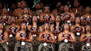
Most Kiwis are generally aware that the average Maori is doing it harder than the average Kiwi by a range of measures, but may not be sure precisely why. In any case, there is much more to the Maori experience than just that.

The correlation between median personal income and being Maori is a moderate -0.48. This is enough to tell us that the average Maori is considerably poorer than the average Kiwi. However, this correlation is not quite as meaningful as it might appear on the surface.

The correlation between median age and being Maori is even stronger, at -0.63, and because there is a mildly significant positive correlation of 0.27 between median age and median personal income it is fair to conclude that Maori are poorer than average, to a small extent, because they are younger than average.

There is a fair amount of cynicism among Maoris regarding Paheka religions. This is reflected in the fact that being Maori has a significant negative correlation with being a Christian, which is -0.37. This will surprise those any who expect that Maoris are like Pacific Islanders in all regards. The correlation between being a Pacific Islander and being a Christian is a moderately strong 0.46, so they are very different to the Maori in that sense.

There is no significant correlation between being Maori and being Anglican – this is 0.02. Being Maori has significant negative correlations with practicising a variety of religious traditions: with being a Catholic it is -0.28, with being Presbytarian it is -0.40 and with being Buddhist it is -0.45.

Even more surprising to some is the strong positive correlation between being Maori and being a Mormon (0.54), as well as the correlation between being Maori and following Spiritualism and New Age religions, which was a mildly significant 0.24. In this latter correlation the Maori share something exclusively with the Paheka, who also have an interest in these traditions, unlike Pacific Islanders and Asians.

The explanation for the strong negative correlation between being Maori and net personal income becomes obvious if one looks at the correlations between being Maori and maximum educational achievement.

Being Maori had a moderate positive correlation with being in all three groups with the poorest education. Being Maori had a correlation of 0.57 with a Level 2 education, of 0.55 with a Level 1 education, and of 0.67 with no qualifications at all.

Even worse for the purposes of making a good income, being Maori had a significant negative correlation with having any of the university degrees. With having a Bachelor’s degree the correlation was -0.45, with having an Honour’s degree it was -0.46, with having a Master’s degree it was -0.45 and with having a doctorate it was -0.41.

It is known that Maori men in particular have the lowest life expectancy of any of the major population groups in New Zealand. Few would dare guess that things are so bad for Maori men that there is a significant correlation between being Maori and being female – this is 0.31.

Related to this unusual death rate, there is one pattern that stands out when it comes to the demographics of Maori. Although Maori are only doing moderately worse than the Kiwi average when it comes to most measures of social health and wellbeing, they still comprise the bulk of the Kiwis at the very bottom of the ladder, who have it hardest of all.

There is a correlation of 0.91 between being Maori and being on the unemployment benefit and a correlation of 0.77 between being Maori and being on the invalid’s benefit. There is also a correlation of 0.92 between being Maori and being a regular smoker and a correlation of 0.79 between being Maori and being a solo parent.

These are very strong correlations and suggest that much of the worst social devastation has happened to Maoris.

There is a significant positive correlation between being Maori and all of the income bands from Loss or No Income up to $50K. There is a significant negative one between being Maori and the three income bands above $70K. One can guess from this that working class industries and occupations are the general trend.

The significant positive correlations between being Maori and working in a particular industry are 0.47 for working in transport, postal and warehousing, 0.44 for working in manufacturing, 0.43 for working in education and training, 0.42 for workign in electricity, gas, water and waste services, 0.38 with working in administration and support services, 0.32 for working in healthcare and social assistance and 0.31 for working in construction.

There are only two industries with a significant negative correlation with being Maori: professional, scientific and technical services at -0.33 and financial and insurance services at -0.26. The former of these is not surprising considering the unusually low representation of Maori on the higher rungs of the education ladder.

True to the long-held stereotype of “Maori being good on guitars and bulldozers”, there is a very strong correlation between being Maori and working as a machinery operator or driver – this is 0.66. There is also a strong correlation of 0.62 between being Maori and being a labourer. The strongest correlation between being Maori and any occupation, however, is with community and personal services, which is 0.72.

Predictably, there is a strong positive correlation between being Maori and having been born in New Zealand – this is 0.70. This may not even be as strong as some might predict, but it ought to be kept in mind that the vast majority of New Zealand Europeans are native born and that there are large Maori populations in Sydney, Melbourne and Brisbane.

*

This article is an excerpt from Understanding New Zealand, by Dan McGlashan, published by VJM Publishing in the winter of 2017.

Understanding New Zealand: Turnout Rate of Party Supporters

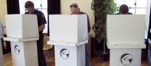
What sort of political party supporter actually turns out to vote? It’s not as straightforward and simple as just old, rich, male and white. However, turnout rate can serve as a useful indicator of general disenfranchisement.

Interestingly, the correlation matrix gives us a clue about a line of information that is completely closed off to anyone running a simpler analysis: we can know which party has the supporters that are most likely to vote by looking at the correlation between party vote in each electorate and the turnout rate in that electorate.

It seems fair to assume that, all other things being equal, the turnout rate of any party’s supporters is roughly equal to the degree that those supporters feel their needs and desires will be taken seriously by the eventual representatives. After all, if your vote will not count for anything because your MP will ignore you anyway, why bother to cast it?

Perhaps more than any other set of correlations, this one tells us who is running the country. If you have money and wealth, you can vote knowing that whoever wins the election will listen to you out of natural shared solidarity. If you are disadvantaged – poor, physically or mentally ill, female in some cases, the wrong religion or race in many others, you can’t.

Unsurprisingly, there is a strong correlation between turnout rate in 2014 and voting for National – this was 0.76. The Labour one, at -0.67, was almost as strong in the other direction. This difference represented by this correlation arguably reflects the most fundamental political division in society – between the haves and the have-nots.

This correlation is large enough that we can predict the vast majority of people who do not turn out to vote are Labour supporters.

Reflecting that the average Green voter is significantly wealthier than the average Kiwi, there is a significant correlation between turnout rate and voting Green – this is 0.26. Probably this would be higher if it reflected the level of class privilege of the average Green voter, but because the average Green supporter is also so young the turnout rate is somewhat suppressed.

The turnout rate was, as it was for Labour, significantly negatively correlated with New Zealand First support. The correlation here was a moderately strong -0.40, which is possibly even a little less negative than one might have expected based on the income of the average New Zealand First voter. Even though the bulk of New Zealand First supporters are working-class Maoris and thus have a low turnout rate, the party has a core of elderly white voters who can be counted on to vote.

The turnout rate was moderately correlated with voting for the Conservative Party in 2014 – this was 0.55, easily the second highest of all the correlations between turnout rate and voting for a party. This is even though voting Conservative in 2014 did not have a significant correlation with median personal income.

The main reason for this is the strong correlation between voting Conservative in 2014 and median age, which was 0.75. Because old people vote at significantly greater rates than the young, and because old people are religious fundamentalists at significantly greater rates than the young, old people will vote for a party (like the Conservatives) that appeals to religious fundamentalism.

All of the parties that had a high proportion of Maori voters had a significantly negative correlation with turnout rate. The correlation between turnout rate and voting Maori Party in 2014 was -0.74, with voting Internet MANA it was -0.69, with voting Aotearoa Legalise Cannabis Party it was -0.68 and with voting New Zealand First it was -0.40.

None of these are surprising considering the strong negative correlation between turnout rate and being Maori (-0.74). It may be that the natural support levels of both the Maori Party and Internet MANA are closer to what the Conservative Party is pulling in, but because of massive disenfranchisement among Maori are unable to translate that support into seats in Parliament.

*

This article is an excerpt from Understanding New Zealand, by Dan McGlashan, published by VJM Publishing in the winter of 2017.

Understanding New Zealand: Voting Patterns of European New Zealanders

Who do the honkies vote for? Most people could have guessed that there was a correlation between voting for the National Party in 2014 and being of European descent, but few would have guessed that it was quite as strong as 0.60. The correlation between voting Labour in 2014 and being of European descent is even stronger, but negative: -0.76.

These are strong correlations, and they ilustrate the degree to which the National Party upholds racial advantages as a consequence of upholding class advantages. Being of European descent has a correlation of 0.35 with median personal income, which conflates the effect of race and class in the National vote.

Voting for the Conservative Party in 2014 had a correlation of 0.46 with being of European descent, and the other party that had a significant positive correlation with being of European descent was the Greens – this was 0.24.

Some might find this latter point surprising considering that the Greens produce a lot of rhetoric about being left-wing and about supporting marginalised groups in society. But marginalised groups generally do not vote Green – they vote Labour. The correlation between voting Green in 2014 and median personal income is a significant 0.31.

This tells us that the Green Party is a curiosity in the paradoxical sense that it represents a class that does not often belong to the race it represents and a race that does not often belong to the class it represents.

Voting for any of the remaining four parties in 2014 has a negative correlation with being of European descent. Three of those four correlations can be explained simply by noting that they are parties which get a lot of Maori support: the ALCP (-0.15), the Maori Party (-0.35) and Internet MANA (-0.37).

The ACT Party stands apart from those three on that basis. The correlation between voting ACT in 2014 and being of European descent is a significantly negative -0.28. This suggests that there is a natural division on the right between the heavily European National and Conservative parties, and the heavily non-European ACT Party.

The natural division on the left, meanwhile, is between the also heavily European Green Party, and the moderately non-European Labour Party. Although this has more to do with education than class, it’s noteworthy that barring a token Maori in the leadership position, only Marama Davidson of the Green MPs has any non-European ancestry.

This is the basis for the observation that a National-Greens Government might be possible after 2017. Essentially this would be a European coup of the political system, knocking out the Maoris in NZF and Labour, the Pacific Islanders in Labour and the Asians in ACT.

Media commentators might talk about crucial demographics and the need to win them to capture the middle ground, but the fact is that the vast bulk of New Zealand voters are people of European descent and a small shift of the balancing point within this major demographic can have nationwide consequences.

European people love to vote, no doubt a reflection of their integration into the system and their confidence that their voices will be heard by the eventual representatives. The correlation between turnout rate in 2014 and being of European descent is a strong 0.71, which is enough to say that, as a general rule, white people vote.

Many might have been able to guess that; few could guess the extent that the flag referendum was a mission for people of European descent only. Turnout rate for the first flag referendum had a correlation of 0.85 with being of European descent, and turnout rate for the second flag referendum had a correlation of 0.88.

The correlation between being of European descent and voting to change the flag in the second flag referendum was 0.60 – exactly the same as the correlation between being of European descent and voting National in 2014. This further supports what we already know about the extent that the flag referendum was a National Party vehicle.

*

This article is an excerpt from Understanding New Zealand, by Dan McGlashan, published by VJM Publishing in the winter of 2017.